The Bit Component is a container for composable pieces of software. You can think about it as a next-generation package. It is extensible, portable and seamless to maintain.
Often components are used build apps, libs, and even distributing to a greater level of granuality, such as independent UI components, modules, hooks and data entities.
In your codebase, components has a minimal footprint, and require no configuration and can be used using expressive module names.
Features:
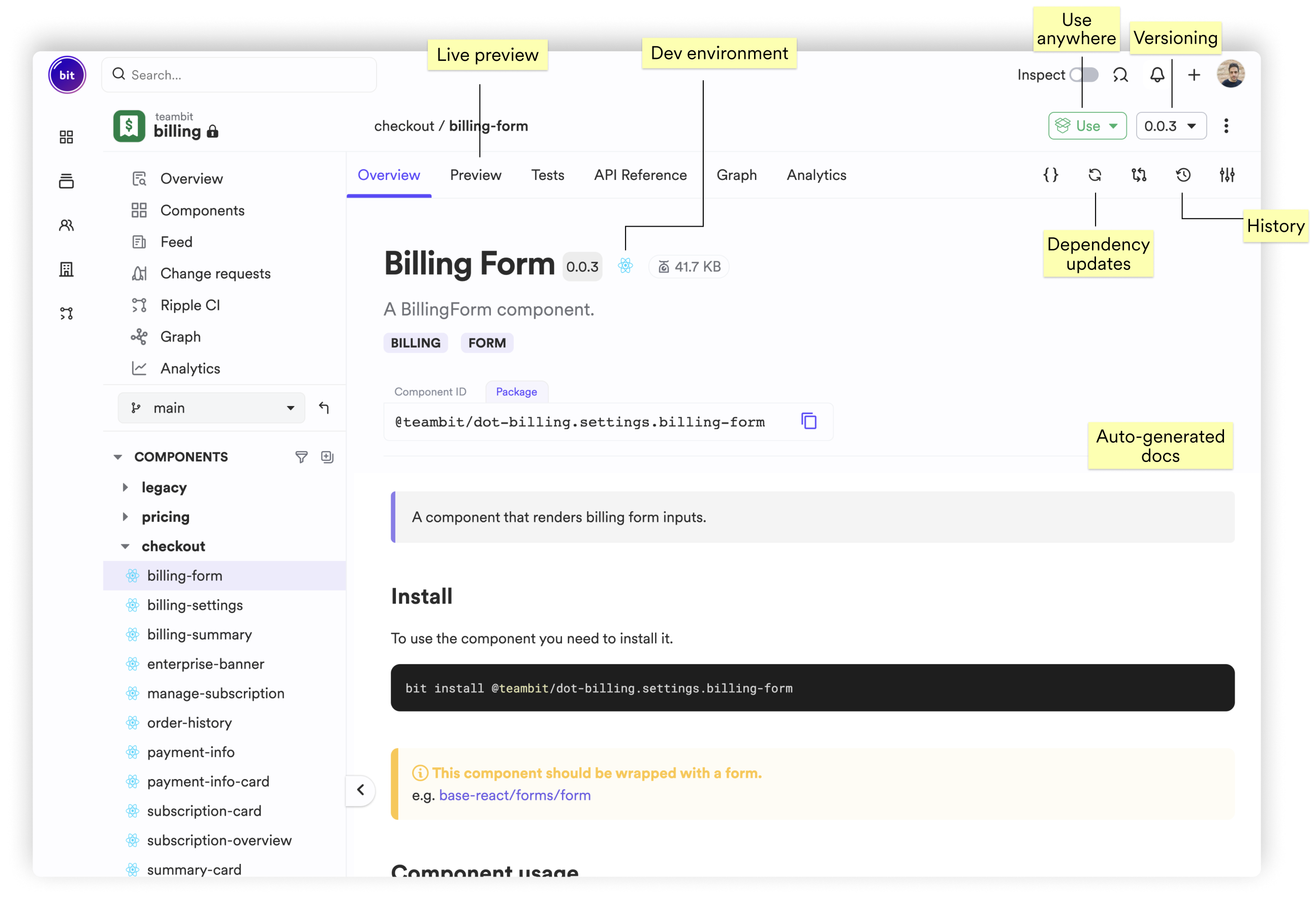
Components have an expressive, and taxonomic naming system. Components names corrspond to ownership and are categorized under namespaces.

Component versioning in Bit is automated, and dependencies and always aims to keep your components on latest. You can also "Pin" specific components to use older versions of packages, and decide how to roll updates across your components.

Component' dependencies and automatically detected, defined, and later versioned. Components are kept safe regardless to changes.
All your have to do is:
import { Image } from '@teambit/docs.ui.zoomable-image';
Bit detects import statements, and automaticlly configures your dependencies accordingly. Learn how to set specific depenencies on Setting dependencies.
Bit Components are seamless to develop from every project, without configuring their build. Since components are using reusable development envs, common configuration files such as: tsconfig.json, babelrc and .eslintrc are not required, and can be in a centric resuable environment.
Components can be automatically used as packages or built into aritfacts you can use at runtime. You can add Build tasks to generate Artifacts for your needs.
You can also connect components to your artifact registry of choice.
bit install @your-org/design.actions.button
Alternatively, you can use every standard packages manager to use the component:
npm install @your-org/design.actions.button
Access and edit code from every project. Remove boundaries and ease the contribution for components. Dev experience becomes standard for all component types, and not limited to a specific workspace, reducing context switching of maintaining shared code.
bit import your-org.design/actions/button
After importing, the chosen component is available to use and modify from the workspace you are working on.
The Component is natively designed for extensibility, and therefore allows for features to be built to it. Out of the box Bit, comes with automatic preview, API Reference, graph visualization, linting, compiling, testing and more. You can disable aspects and enable them for your component per your preference.
These are just a few of the services, you can find more in our community.
Components are hosted on Bit Cloud or on your self-hosted scopes, a complete platform for building composable software.