
Compose with AI
Compose
with AIThe next-generation build system for software composition in the AI era
*It's open source and free!

From Code Generation to Software Composition
Bit organizes source code into composable components, empowering to build reliable, scalable applications in the era of AI.
App shells
Compose reusable components, pages and features into app shells.Reusable components
Create reusable UI components and modules to reuse across your software.Standard building blocks
Define the blueprints for creating components for humans and AI as one.AI agent integration
Instantly generate component boilerplate, tests, and documentation.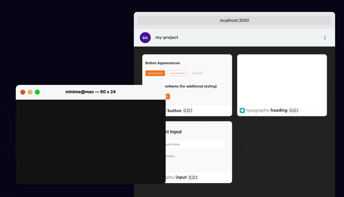
Building with components
Loved by developers from the world's best teams


Get started with your solution of choice
Component LibrariesLEARN MORE
MonorepoLEARN MORE
Micro FrontendsLEARN MORE
MultirepoLEARN MORE
PlatformsLEARN MORE
App shellsLEARN MORE
A Perfect Fit for Your Stack
Start building new features in a composable architecture and modernize your existing legacy projects.
Leverage existing code
Create new features and components leveraging your existing codebase.Built-in MCP server
Use Cursor or Github Copilot to create and reuse components.Fully extensible
Bit uses Bit. Extend Bit to automate and consolidate your workflow.Connects all moden tooling
Bit is fully compatible to standard tools in the JS ecosystem.
