
Compound Digital Assets
Compound
Digital AssetsBuild, version, and share components to create scalable applications faster than ever
*It's open source and free!

Monolithic Packages Are Slowing You Down
Contributing a new component is a chore. Updates are risky, documentation is always stale, and developers would rather build from scratch than try to find what they need.
Rewriting components
Risky updates
Outdated documentation
Hard to contribute
Adoption hurdles
Outdated usages

Your Modern and Dynamic Component Library
Bit organizes source code into composable components, empowering to build reliable, scalable applications in the era of AI.
Create with AI
Quick start your next library with AI from scratch or using existing libraries.Visual docs & preview
Automatic docs, API reference and visual preview for your components.Independent versioning
Release safely without the fear of breaking or causing side effects.Frictionless contribution
Empower developers to contribute new components to the library at ease.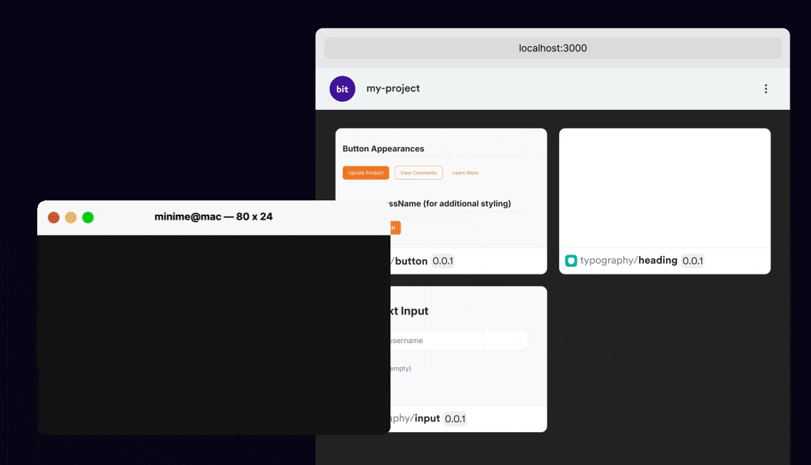
A basic UI component library, that can be used to assemble features and apps
Loved by developers from the world's best teams


Build Components, Independently
Build, test and document components at ease and release without the fear of breaking.
Create components using AI or based on pre-built or custom templates.
1
$ bit create react pages/chatbot
2
1 component(s) were created
3
4
acme.ai/pages/chatbot
5
location: ai/pages/chatbot
6
env: bitdev.react/react-env (set by template)
7
package: @acme/ai.pages.chatbot
8
9
10
Compose components using descriptive package names. No aliases required.
import{PageLayout}from"@acme/design.layouts.page-layout";
import{Chatbot}from"@acme/ai.ui.chatbot";
import{PromptEditor}from"@acme/ai.ui.prompt-editor";
import{AI}from"@acme/ai.ai";
import{Card}from"@acme/design.content.card";
import{Button}from"@acme/design.actions.button";
Seamlessly build with built-in professional build standards, IDE integration and tools.
compile
test
lint
build
1
$ bit compile
2
STATUS COMPONENT ID
3
✔ SUCCESS envs/aspect
4
✔ SUCCESS account
5
6
✔ 353/353 components compiled successfully.
7
8
9
10
11
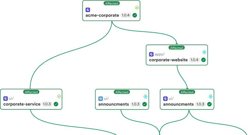
Safe, independent releases. Release only components which changes with integration to your CI of choice.
$ b

Discoverability & Contribution on Autopilot
Streamline discoverability and contribution of components. Seamless reuse them across pages and apps.
Documentation on Autopilot. Bit auto-generates rich, interactive docs with live preview and API reference.
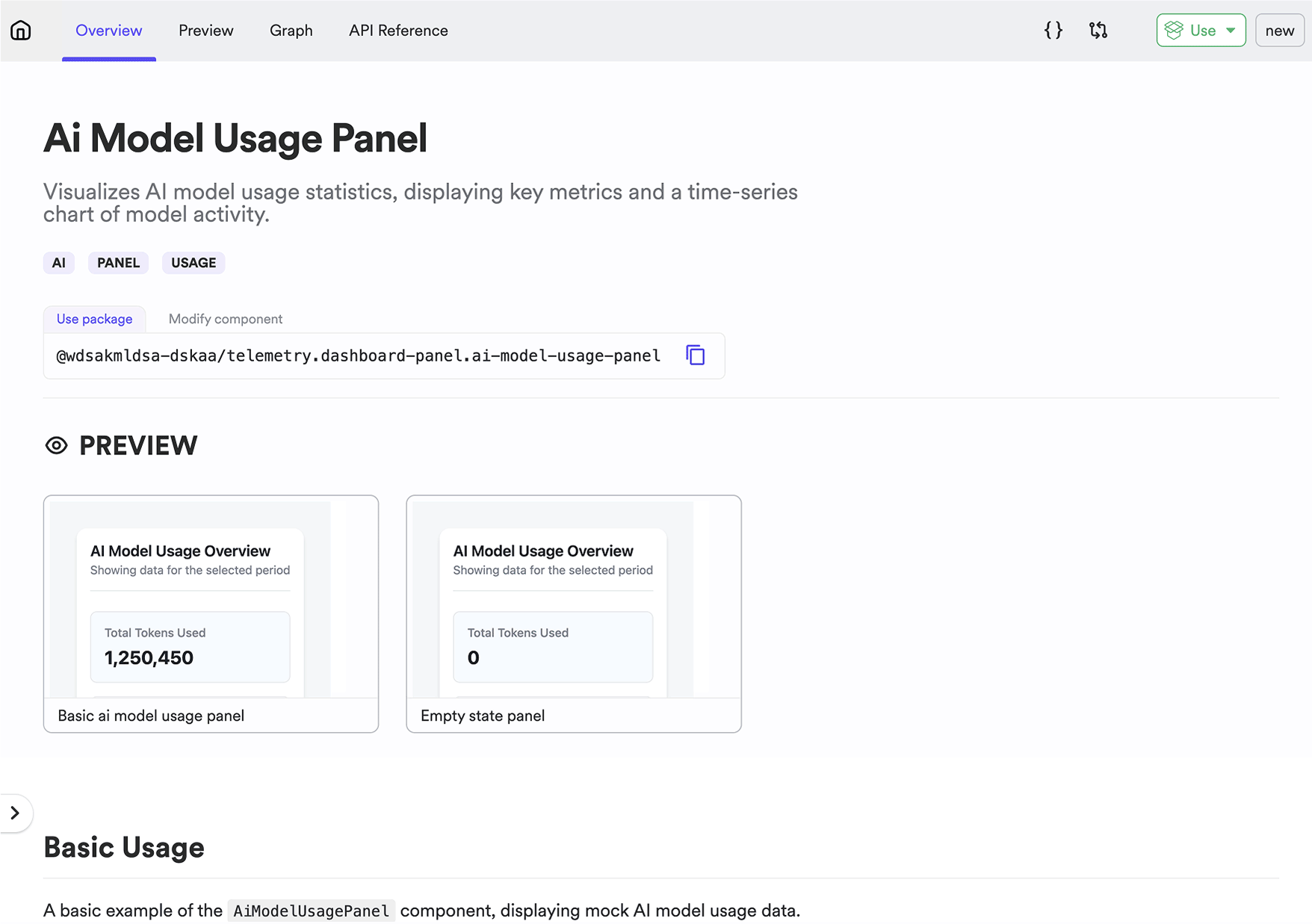
Ready-to-use packages. All modules available as packages without further configuration or setup.

Contribute or propose component changes. A single command to change packages from every project context.
$ b
A Perfect Fit for Your Stack
Start building new features in a composable architecture and modernize your existing legacy projects.
Leverage existing code
Create new features and components leveraging your existing codebase.Built-in MCP server
Use Cursor or Github Copilot to create and reuse components.Fully extensible
Bit uses Bit. Extend Bit to automate and consolidate your workflow.Connects all moden tooling
Bit is fully compatible to standard tools in the JS ecosystem.
