Compositions allow to simulate components in different variations for testing, visualization and discoverability purposes.
A UI component composition is the rendering of that component in a certain state and context. A non-UI component composition is the visualization of the component's I/O and its effects (for example, the effects a React hook has on a consuming UI component).
Compositions provide insight into a component's look and behavior in various likely usages. They help component maintainers deliver components that are "true to their promise" and behave as expected when consumed by other components or projects.
Compositions also demonstrate components for other developers looking to use them, and non-developers, such as designers and product managers, looking to inspect them.
To explore compositions in your Workspace UI, start the local development server (bit start), browse to a specific component and select the compositions tab.
Use the right sidebar to navigate to other available compositions.
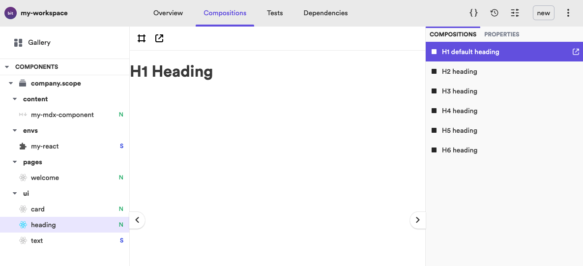
Compositions are also available to be viewed in the remote Scope UI (for example, on Bit.cloud).
Create a *.composition.* file inside your component's directory.
└── heading ├── heading.composition.tsx ├── heading.docs.mdx ├── heading.module.scss ├── heading.spec.tsx ├── heading.tsx └── index.ts
Import the component into the compositions file to use it in a new composition. Export that composition with a name. The PascalCase/camelCase name of the exported composition serves as the composition title in the UI, after it is converted to a human-friendly format.
import React from 'react'; import { Heading } from './heading'; export const H1DefaultHeading = () => <Heading>H1 Heading</Heading>; export const H2Heading = () => <Heading element="h2">H2 Heading</Heading>; export const H3Heading = () => <Heading element="h3">H3 Heading</Heading>;
To override a composition's name use the compositionName API:
export const H1DefaultHeading = () => <Heading>H1 Heading</Heading>; H1DefaultHeading.compositionName = 'a custom composition name';
The Compositions Aspect is set, by default, to detect all *.composition?(s).* files from the component directories. It uses the preview Aspect to display the content of composition files with the *.{t,j}s?(x) extension. Learn more about this process. .
Change the glob pattern for the files to detect, and (of that group of files) the files to preview, by using the Workspace Aspect config interface:
{ "teambit.compositions/compositions": { // Glob pattern to detect composition files. This includes all related files, like styles and JSONs. "compositionFilePattern": ["**/*.simulations.*"], // Glob pattern to select Preview files. This will only include files matched by compositionFilePattern. "compositionPreviewFilePattern": ["**/*.tsx"] } }
dev files
Composition files are defined by the Composition Aspect, as dev files . That is because compositions are only used in development, and not in runtime.
Compositions are not only a way to manually validate a component behaves as expected. Each composition can and should be used as a test sample for automated tests.
Import the compositions into your test file to run the appropriate tests.
For example, a test for a 'button' component may look like so:
import React from 'react'; import testRenderer from 'react-test-renderer'; import { PrimaryButton } from './button.compositions'; describe('Button', () => { it('renders correctly as "primary"', () => { const component = testRenderer.create(<PrimaryButton>test primary variant</PrimaryButton>); const tree = component.toJSON(); expect(tree).toMatchSnapshot(); }); });
See here to learn more about running component tests.