 React
React NodeJS
 Harmony
 Angular
 Vue
VueRun the following to create a workspace for your React components:
The generated workspace includes workspace-level configuration, configuration files for your IDE, and a customizable React env for your React component development.
To learn how to initialize a Bit workspace on an existing project, see Add Bit to an existing project.
Run the following to create a component using your env's 'react' template:
Component compilation
Run Bit's development server (bit start) or watch mode (bit watch) to compile modified components.
Make your component as extensible as possible by passing all props native to the root element, using the ...rest pattern. Enable custom styles using the className prop.
Extensibility is key to maximizing component reuse.
/* @filename: welcome.tsx */ import type { ReactNode, HTMLAttributes } from 'react'; export type WelcomeProps = { children?: ReactNode; className?: string; } & HTMLAttributes<HTMLDivElement>; export function Welcome({ children, className, ...rest }: WelcomeProps) { return ( <div {...rest} className={`welcome ${className}}`}> {children} </div> ); }
Expose your component's API and public types in the component's main file (index.ts, by default):
/* @filename: index.ts */ export { Welcome } from './welcome.tsx'; export type { WelcomeProps } from './welcome.tsx';
Verify that your component behaves as expected by rendering it in various relevant contexts and variations.
For example, the following basic composition displays the page/welcome component when children = 'hello world!'.
// @filename: welcome.compositions.tsx
import { Welcome } from './welcome';

export const BasicWelcome = () => {
  return (
    <Welcome>hello world!</Welcome>
  );
}You can add other compositions by exporting additional components, from the same file or other *.composition.* files.
Head to the component's 'Compositions' tab, to see your rendered compositions (run bit start if you don't have the workspace UI running, already).
Head over to your component's .spec.tsx file to add automated testing.
We recommend using your compositions as the base for your testings. For example:
import { render } from '@testing-library/react'; import { BasicWelcome } from './welcome.composition'; it('renders with the correct text', () => { const { getByText } = render(<BasicWelcome />); const rendered = getByText('hello world!'); expect(rendered).toBeTruthy(); });
See the Testing docs for more information.
To use a dependency, whether it's a component or a package, install it in your workspace, and import it into your component's files (components maintained in the same workspace do not need to be installed, but are consumed via their package name, nonetheless). For example, the following installs the paragraph component:
Import that component into your component's files:
/* @filename: welcome.tsx */ import type { ReactNode, HTMLAttributes } from 'react'; /** * components are imported using their package name. * do not use relative paths. */ import { Paragraph } from '@teambit/design.typography.paragraph'; export type WelcomeProps = { children?: ReactNode; className?: string; } & HTMLAttributes<HTMLDivElement>; export function Welcome({ children, className, ...rest }: WelcomeProps) { return ( <div {...rest} className={`welcome ${className}}`}> {children} </div> ); }
To use this component as a dependency of another component, run
bit show pages/welcometo see its package name. Use the package name to import it into other components.
Your component's documentation is automatically generated from its code.
To add your own custom documentation, create a todo.docs.mdx documentation file inside the component directory.
MDX doc files use the MDX format.
For example:
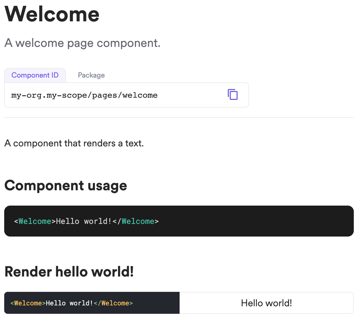
---
description: A welcome page component.
---

import { Welcome } from './welcome';


A component that renders text.

### Component usage
```js
<Welcome>Hello world!</Welcome>
```

### Render hello world!

```js live
<Welcome>Hello world!</Welcome>
```
Snap your component and export it to its remote scope, to enable others to consume it and collaborate on it.