Composing Reusable Landing Pages in Components
Introduction
Recently, we had to create a landing page that allows people to request a demonstration of our product. The page is quite simple - it contains a header, some text, and a form. The Figma design looks like this:
If you were to build this page, how long would it take? I must tell you that I developed this page relatively easily. What's the secret? Almost all of the components needed to build this page had already been built by the other teams.
As an example, I had the header, the input, and even the text-separator in the design scope. Using them was as simple as installing them in my Workspace.
During the creation of this page, here's how I looked:
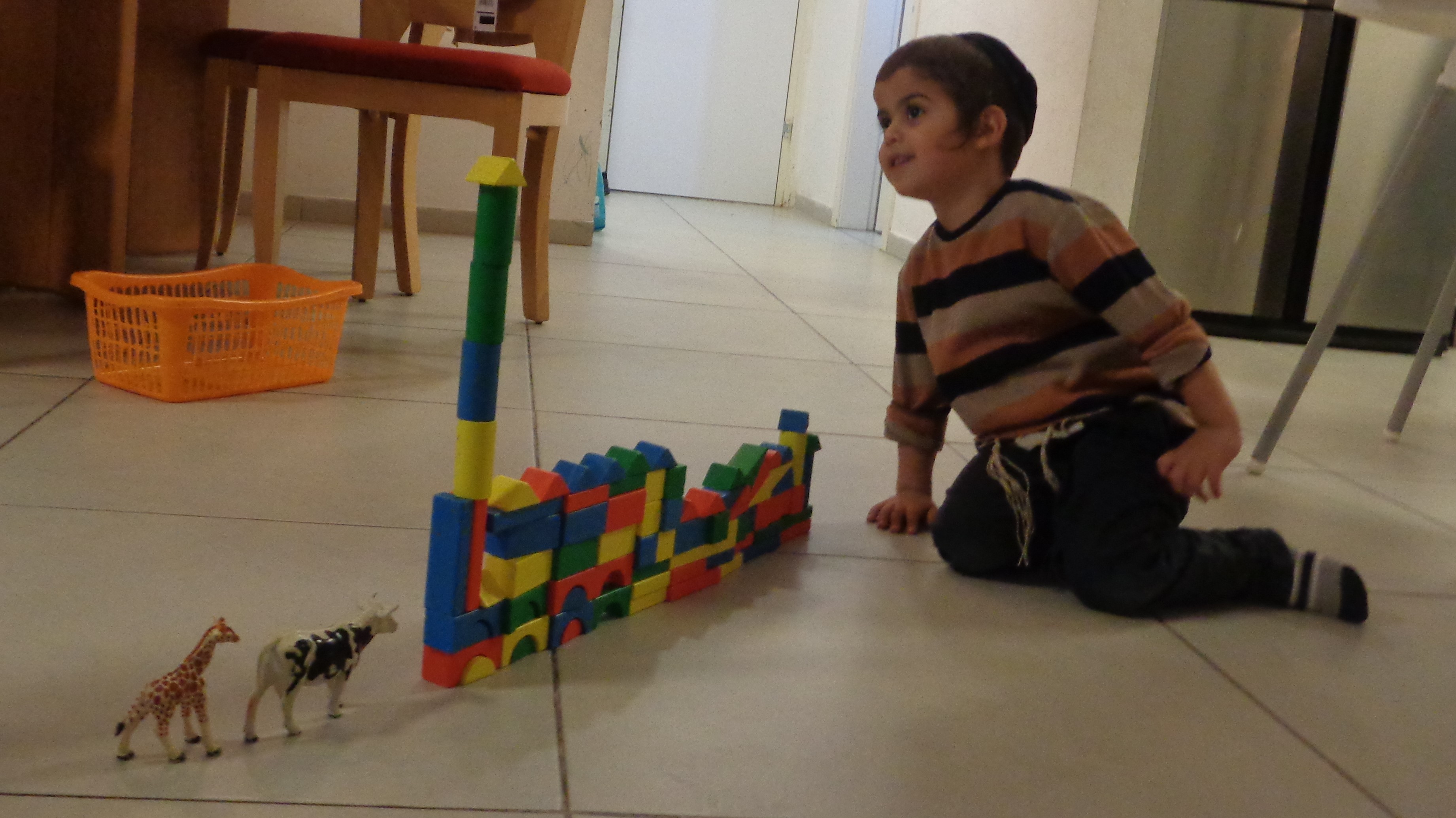
Oops. This is my son playing with Lego. I apologize for the mistake. Below is me:

Yep. It was that simple. As simple as playing Lego. 🙃
However, the point of this post isn't the ease of my workflow. In this blog post, I want to show you how I created the landing-page component, so I can reuse it to spawn new landing pages.
I already knew that we would have to create more similar pages in the future when I was asked to develop this page by the members of the product team. This prompted me to create a generic component for landing pages that can be used to quickly build additional landing pages.
As you'll see throughout this guide, the main benefit of this generic landing page component is that refactoring the landing pages will be easier this way. If I update the generic landing page component - let's say replace the header - this will be reflected on all landing pages, regardless of where they are located.
Let's get going!
This guide assumes that you have a bit.cloud account and know how to open a remote scope.
Building blocks and dependencies
Please make sure that the Bit binary is installed on your machine:
npx @teambit/bvm install
Let's dive right into the deep water. Let's examine the API of the generic landing page component.
If you want to follow along, create a Bit Workspace
And fork the generic landing page component:
You'll notice that the code is quite simple. Here's its API:
export type LandingPageProps = {
  /**
   * form of the page
   */
  Form?: ReactNode;

  /**
   * heading, description and additional optional nodes of the page
   */
  PageDescriptionProps?: PageDescriptionProps;
  /**
   * Meta data of the page
   */
  metaData?: MetaData;
} & React.HTMLAttributes<HTMLDivElement>;First, we have the Form property. This is the form that will appear on the page. Every page will have a form, but we don't know what form this form will take (e.g. a contact form, a demo request form, etc.).
As you can see, this anonymous form has some styles added. Almost like saying "I don't know who you are, but I do know where you live".
<div className={classNames(styles.wrapper, className)} {...rest}>
  {React.Children.map(Form, (child) =>
    React.cloneElement(child as React.ReactElement, {
      className: styles.form, // <---- We clone the element and add the styles
    })
  )}
  <div className={styles.left}>
    <PageDescription
      {...PageDescriptionProps}
      form={Form} // <---- We pass the form to the PageDescription component for mobile responsiveness
      className={styles.pageDescription}
    />
  </div>
</div>Additionally, we pass the form to the PageDescription component. The reason is that the form on desktop view is always in the center of the page, but on mobile view, the form disappears (display: none) and is replaced by the form in the PageDescription component.
The next property is PageDescription. The heading, description, and optional nodes that appear on the left of the page are contained in this property.
Lastly, we have the metaData property. This is the meta data that will appear on the page (e.g. the title, the description, the keywords, etc.).
The bubble graph and the header are static elements that are not part of the generic landing page API.
In the next section, we'll create the first page component.
Composing the landing page
Now that we understand the API of the generic landing page, let's create the first page component.
You can either fork the first page component:
or create a new one from the react template:
The code of the page component is
very simple. We're just passing it the props described above(metaData, PageDescription and the Custom form that will appear on the page).
Essentially, there are two major benefits to this page component:
- It is composed of the generic landing page component, and by creating a new component for it, it is automatically updated. Here is a dependency graph that visualizes it:
- Creating a component for it lets us reuse it in the future. As you can see we are reusing both in the landing pages app and the slides app. Whenever we modify the generic landing page component, all the places where we reused a page component (composition of the generic landing page) will also be updated.
Check out this slides page to see how we reused the same page component again.
Deploying the landing page
For our setup, we decided that all landing pages would be deployed on the Bit Cloud at the /pages route.
This is why we created only one app component. The app component is the main component that is deployed on the Bit Cloud. You can learn more about Bit's app components here.
You can fork the app component and customize it to your needs:
In the app.tsx file, we are rendering the page
<Routes>
  <Route path="/pages/*">
    <Route path="component-platform-demo" element={<ComponentPlatformDemo />} />
  </Route>
</Routes>If your setup is diffrent and you are required to deploy the landing pages on a different route, you can create a new app component for each landing page.
The app component above uses the Netlify deployer component to deploy your app whenever you tag it.
All you have to do is to replace your credentials in the in the bit-landing-pages.react-app.ts file:
const netlifyConfig: NetlifyOptions = {
  accessToken: process.env.NETLIFY_AUTH_TOKEN as string,
  siteName: 'bit-landing-pages',
  team: 'teambit',
};You just need to (tag)[https://bit.dev/docs/components/tags] your app with a new version, and it will be deployed to Netlify as part of the tag pipeline.
That easy huh? :)
Summary
In this tutorial, we discussed creating a generic landing page component. This led to creating concrete components for the pages and reusing them in several places while still getting updates from the generic component.
This is the beauty of composable software. There are hundreds of Bit(s) of code that are independently reusable and can be used to create new pieces of software that are also independent from the other pieces of software all while keeping the dependency graph intact.
Therefore, every component becomes a valuable asset that can be reused ♻️ in the future. This way you save time ⏳ and money 💰.
If you have any questions, feel free to contact us on our Slack channel.
To book a demo, please fill out this form:
Okay, this form doesn't really belong here, but I just had to show you how I reused the same form component after I created it once in the landing-pages scope. If I update the orginial form component, all the places where I reused it (such as this blog post) will be updated.
Cheers 🥂