Building a Composable UI Component Library
It is not easy to design a component library. A long list of decisions is involved, which can be overwhelming. Making the wrong decision can result in a library that isn't widely used.
This guide's goal is to create a component library that is easy to build and scale, as well as to ease adoption and collaboration between product teams across the organization.
In this guide, we'll learn how to use composability and components to address the toughest challenges associated with a component library, like development, dependencies, updates, builds, testing, documentation, distribution and adoption.
After reading this article, you will be ready to create your organization's shared component marketplace with composable components that everyone can easily use, find, and collaborate on.
Are you ready? Let's get started!
Bird's Eye View
Before we begin to construct our component library, let's take a closer look at some of the components we'll be creating, and how they can be used across the organization.
Go ahead and play with this live dependencies graph:
Bit components are divided into scopes. By grouping components into logical groups, it is easy to find and understand their purpose.
At the top of the dependency graph above, you can see the button from the component-library scope we're going to build. This scope includes headless components, which do not have visual representations.
One level below, you'll see the fancy-button component from the design scope. This scope adds CSS styles to components in the component-library scope.
Lastly, at the bottom, you can see how the entire organization is consuming the components within the design scope. Notice how we compose new buttons from the fancy button and not use it directly.
In this way, "broken components" are easier to replace. If we need to replace the fancy-button for whatever reason, we don't need to search for dozens of components consuming it.
Setup and Workspace
This guide requires a bit.cloud account and a remote scope. Create a bit.cloud account and follow the video instructions to create a remote scope.
Please make sure that the Bit binary is installed on your machine:
npx @teambit/bvm install
First, we need to set up our local development environment. In Bit, you develop independent components in a Workspace.
A Workspace is a development and staging area for components. Here, we create new components, retrieve and modify existing ones, and compose them together.
The Workspace makes this experience seamless as if you were working in a monolith, but your development is still distributed and highly scalable. The Workspace does not "store" components. Regardless of where they reside, such as bit.cloud or the local server, they can be imported into the Workspace.
When imported, you can modify components, update versions, and ripple out changes to other projects and developers. A new Workspace can be created anywhere on demand.
In my personal quick-workflow, I spawn Workspaces from temporary folders that are automatically deleted once my computer is restarted.
Understanding that Workspaces are just staging areas for components is essential. It is the place where Bit can manage components, their development lifecycles, and the relationships (dependencies) between them, as well as build and test components.
It's time to initialize your first Workspace!
Navigate to the designated folder and enter the following commands in your terminal:
bit new react my-component-library --empty --skip-git --default-scope [your-cloud-user-name].component-library

cd my-component-library
With this command, you will create a Workspace based on the React Workspace template, empty of demo components without setting up a git repository (we don't need one), and with your remote scope set by default (which means that any components created will belong to this scope unless we specify otherwise).
The following two files are relevant to notice in our Workspace:
.bitmap: Here, Bit stores the information for the components currently in your Workspace. You should not be editing this file."root":{...}workspace.jsonc: This is where you configure your Workspace."root":{...}
Component development
Now that we have set up our Workspace environment, it is time to add your first component.
A component in Bit can be created in one of three ways:
- Using the bit create command. Since it auto-generates the necessary files, it is the easiest way to create a brand-new component.
- Using the bit add command. This is how we add existing files to Bit so that they can be tracked.
- Using the
bit forkcommand. Using this method, you can copy existing components to your workspace and detach them from their origin. It will be cloned and added to your Workspace with the scope you specify.
To save you time, we'll fork existing components from the teambit.base-react scope rather than creating them from templates using the bit create command.
The first component we'll fork is a button:
bit fork teambit.base-react/buttons/buttonBravo! You have created your first independent component.
You will now be able to see the component in your .bitmap file:
{
    "buttons/button": {
        "scope": "",
        "version": "",
        "mainFile": "index.ts",
        "rootDir": "component-library/buttons/button"
},Bit knows which components are present on your Workspace by reading the .bitmap file. We have not yet tagged and exported the component, so it has no version or scope. Don't worry. We'll get to it in the next section.
By running Bits' development server, you can visualize your component and see any changes you have made:
bit startVersioning
Now that we have created our first component, Bit will keep track of any changes you make.
You can run bit status at any time to get an overview of your Workspace: which components have been modified and are awaiting tagging, which are staged and awaiting export, and if any errors have been encountered.
It's time to tag the first version of our button. Type the following command:
bit tag buttons/button -m "first version"Running the tag command without specifying components will tag all modified components in your Workspace.
When tagging a component, compilation, testing, and building are done. Consequently, the component can be trusted to work correctly.
Think of a tag as something similar to a git commit. It is how you mark a component as exportable. This locks the component's state to the tagged version. Tags and commits differ in that tags in Bit save the state of each component, whereas commits save the state of the entire repository.
Depedencies
Dependencies are at the heart of composable software. When you change a component, Bit will update the dependencies graph for that component. Therefore, if you change a component, you are also changing its dependent components. The dependencies graph is used to derive tests, builds, and versions. This makes the development process more efficient and reliable.
If you are interested in learning more about how painless it is to use Bit for dependency management, please read this blog post by Zoltan Kochan.
The next step will be to fork a dependency of the original component we just forked:
bit fork teambit.base-react/navigation/linkLet's update the import statement in our buttons/button component to point to our newly created component. Replace my user name with yours:
- import { Link } from "@teambit/base-react.navigation.link";
* import { Link } from "@nitsan770/component-library.navigation.link";The Workspace UI now displays the updated dependency graph:
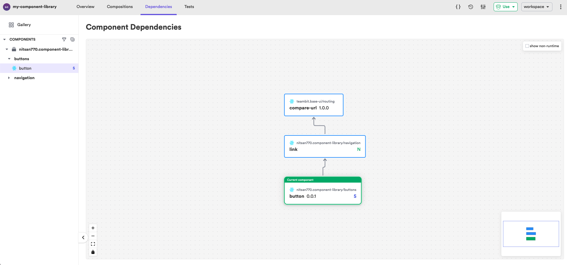
Modifying and tagging a component will automatically tag its dependents as well. This allows us to keep all components in sync.
Let's give it a shot! Running bit status will show you that navigation/link is classified as new
new components
(use "bit tag --all [version]" to lock a version with all your changes)

> navigation/link ... okIt needs to be tagged with a first version:
bit tag -m "tagging the link first version"Next, let's modify the BasicLink composition in the link.composition.tsx file:
- export const BasicLink = () => <Link href="https://bit.dev">bit.dev</Link>;


* export const BasicLink = () => (
    <Link href="https://bit.cloud/blog">The Bit Blog</Link>
);If you run bit status again, you will see that the button is pending to be tagged, even though we didn't modify it!
modified components
(use "bit tag --all [version]" to lock a version with all your changes)
(use "bit diff" to compare changes)

     > navigation/link ... ok

components pending to be tagged automatically (when their dependencies are tagged) > buttons/button ... okEvery component has its package.json and is considered an independent package. In any project, it can be installed using npm, yarn, or pnpm.
Very soon, we will be adding a new tool to bit.cloud called Ripple. As its name implies, its purpose is to automatically tag all dependents as part of the export process (CI).
Within a local Workspace, all dependents of a modified component are tested, built, and tagged. Ripple will do the same, but in a broader context - the entire organization. The local Workspace is expanded by Ripple. Ripple could be used to update a single component, such as a button, and have all components that consume it update as well.
Building
What makes bit a better way to build components than NPM?
- It builds only modified components, so it is faster.
- Built-in incremental builds: When you build a component, all of its dependents are also built by Bit.
- Bit isolates all of your components before building them. Bulletproofing ensures that your components are safe to use.
Builds take place in an isolated environment called a Capsule, which is separate from your Workspace. This way, we ensure that every component is independent and not tied to the Workspace.
To view your Workspace capsules, run the following command:
bit capsule listGo to your Workspace capsules root-dir:
workspace capsules root-dir:
/Users/nitsancohen/Library/Caches/Bit/capsules/d80d38ec5c1abe3bba5f4c1325b9fbafafd93e55Each component of your Workspace will be listed in its directory. For instance, you'll find the following directories in the nitsan770.component-library_navigation_link@0.0.1 directory:
├── artifacts
├── dist
├── example
├── node_modules
├── package-tar
└── types
Bits` build process is fully extendable and customizable. You can easily add new build tasks or modify existing ones.
Sometimes, you may want to build your source files without triggering the tag pipeline. This is easily accomplished with the bit build command.
Let's look at a list of build tasks that the button component will go through when the build task is triggered. Run:
bit build --list-tasks buttons/buttonYou'll notice a list of tasks printed as an output:
Tasks List
id: nitsan770.component-library/buttons/button@0.0.5
envId: teambit.react/react

Build Pipeline Tasks:
teambit.harmony/aspect:CoreExporter
teambit.compilation/compiler:TSCompiler
teambit.defender/tester:TestComponents
teambit.pkg/pkg:PreparePackages
teambit.harmony/application:build_application
teambit.preview/preview:GenerateEnvTemplate
teambit.preview/preview:GeneratePreview

Tag Pipeline Tasks:
teambit.pkg/pkg:PackComponents
teambit.pkg/pkg:PublishComponents
teambit.harmony/application:deploy_application

Snap Pipeline Tasks:
teambit.pkg/pkg:PackComponents
teambit.harmony/application:deploy_applicationWe won't go into great detail about them, but I think you can get a sense of what they do from their name.
Testing
Bit's ability to isolate your component is fantastic when it comes to testing components.
A capsule will be generated and tested for each of your Workspace components upon running bit build. In this way, we ensure the built code works as expected.
Furthermore, its dependents will be automatically tested (as part of the build pipeline).
However, you can also test your component during development. Either run bit test or use the --watch flag to test after every modification.
Let's see what happens when we run the following command:
bit test --watchThere was a failure! We modified the BasicLink composition in the Dependencies section. As a result, one of our tests failed. Let's take a step back. What are compositions?
Compositions allow components to be simulated in different variations. These can then be used for testing, visualization, and discoverability. Let's focus on compositions as a testing tool for now.
We must first fix the test related to the composition we modified:
link.spec.tsx- describe('native html link', () => {
- it('should render', () => {
- const { getByText } = render(<BasicLink />);
- const rendered = getByText('bit.dev');
- expect(rendered).toBeInstanceOf(HTMLElement);
- });
- it('should link to target', () => {
- const { getByText } = render(<BasicLink />);
- const rendered = getByText('bit.dev');
- expect(rendered.tagName).toEqual('A');
- expect(rendered).toHaveProperty('href', 'https://bit.dev/');
- });
* describe('native html link', () => {
* it('should render', () => {
* const { getByText } = render(<BasicLink />);
* const rendered = getByText('The Bit Blog');
* expect(rendered).toBeInstanceOf(HTMLElement);
* });
* it('should link to target', () => {
* const { getByText } = render(<BasicLink />);
* const rendered = getByText('The Bit Blog');
* expect(rendered.tagName).toEqual('A');
* expect(rendered).toHaveProperty('href', 'https://bit.cloud/blog');
* });As soon as we save the file, we will see the following happy announcement:
PASS component-library/navigation/link/link.spec.TSX
native HTML link
✓ should render (27 ms)
✓ should link to target (6 ms)
✓ should open in new tab/window, when external=true (4 ms)
✓ should pass active styles when explicitly active (21 ms)
✓ should not pass active styles when explicitly not active (6 ms)
✓ should automatically pass active style when matching location (5 ms)
✓ should automatically skip active style when not matching location (9 ms)

Test Suites: 1 passed, 1 total
Tests: 7 passed, 7 total
Snapshots: 0 total
Time: 1.117 s, estimated 2 s
Ran all test suites.The method is simple: create compositions of all the permutations you want for your component, and then test them.
But compositions aren't just about viewing/testing component states. Compositions allow us to compose components with each other and simulate their actual environment.
You can, for example, compose the buttons/button component with a simple card component. Let's install the card component first:
bit install @teambit/design.ui.cards.cardNow we can use it in the button.composition.tsx file:
import { Card } from '@teambit/design.ui.cards.card';

export const ButtonInACard = () => (
  <Card>
    <Button>Button</Button>
  </Card>
);The next step will be to test our newly created composition:
import {
  BasicButton,
  ButtonWithCustomStyles,
  ButtonAsALink,
  ButtonInACard,
} from './button.composition';

it('Should render a button element when rendering the card', () => {
  const { getByText } = render(<ButtonInACard />);
  const rendered = getByText('Button');
  expect(rendered).toBeInstanceOf(HTMLElement);
  expect(rendered.tagName).toEqual('BUTTON');
});Theming and styling
How long will it take you to change the brand of your entire organization?
When theming with Bit, you only need to create a theme component. Changes to the theme colors will propagate to all components (apps) that use it. This is so simple, the design team can do it themselves.
Without further ado, let's fork this component:
bit fork teambit.base-react/theme/theme-providerTo keep things simple, let's also fork the base-theme component from teambit/design scope:
bit fork teambit.design/themes/base-themeTheme/theme-provider creates a React Context Provider, which turns design tokens into CSS-VARS/CSS IN JS.
We import the theme/theme-provider component into the theme/base-theme component. Modify the import statement to match the forked component.
- import { createTheme } from '@teambit/base-react.theme.theme-provider';
+ import { createTheme } from '@nitsan770/component-library.theme.theme-provider';It is now just a matter of changing the design token values.
We can add a button-border-radius value, for example:
base-theme-schema.tsexport interface BaseThemeSchema {
//border radius values
buttonBorderRadius: number;
...export const baseThemeDefaults: BaseThemeSchema = {
buttonBorderRadius: 4,
...We can now access this value in our buttons/button component in our buttons/buttoncomponent.
Add this file:
button.module.scss.button {
border-radius: var(--button-border-radius);
}Then import it and the classNames function:
buttons.tsximport styles from './button.module.scss';
import classNames from 'classnames';Finally, pass the imported styles and the overriding styles that the component consumers can pass. You should place the overriding styles as the last argument in the classNames function:
- <button className={props.className} ref={ref} {...allProps}>
+ <button
+ className={classNames(styles.button, props.className)}
+ ref={ref}
+ {...allProps}
+ >
The above is only the tip of the iceberg for theming and design tokens. You can read this blog post component about design tokens to further your education.
Documenting
"It works anyway", "Documenting is boring." I'm sure you've heard these excuses when you ask your fellow developers to document their code.
Here's some good news - component documentation with Bit is fun!
Documentation for Bit components is written in MDX. No more boring sentences, now you can embed anything you want to make your component more visual.
You can, for instance, embed the Figma design in the documentation. You can use this to compare the actual compositions to the original design and to get an idea of how the component was designed:
A live playground where people can try out the component by changing the props is a must-have:
Button with custom styles
Even the "boring" Node.js components are fun when you see the data they return:
Also, Bit makes your life easier by extracting the component props into a prop table:
stringnumberArray1 | 2 | 3 | 4 | 5 | 6 | 7 | 8 | 9 | 10 | 11 | 12'h1' | 'h2' | 'h3'TypographyVariants.Headline1 | TypographyVariants.Headline2 | TypographyVariants.Headline3And don't forget that documentation is part of the component! It means that the component's author does not have to go to an external website or use external tools (which makes his life difficult), the component documentation always appears when navigating to the component. Now you have no excuses!
The components we forked include lots of examples, so let's look at one of them to see how to document a component properly:
button.docs.mdx---
description: A standard, accessible and customizable Button
labels: ['button', 'ui', 'base', 'aria']
---
import { Button } from './button';
import { Image } from '@teambit/base-react.content.image';
Base, non-styled and standard Button. Designed for consistency, accessibility and customization. Supports mouse, keyboard, and touch interactions, focus behavior, and ARIA props for both native button elements and custom element types.
On the surface level, building a custom styled Button might seem simple. In reality, there are different issues that emerge such as custom element support (e.g. `a' and `span` elements), mouse and touch event handling and up until keyboard bindings.
### Button with custom styles
'''ts live=true
<Button style={{ background: 'red' }}>Click here!</Button>
'''
### Button with press event
'''ts live=true
<Button onPress={() => alert("hello there!")}>click me</Button>
'''
### Button with Icon
'''ts live
<Button>
<Image src="https://static.bit.dev/bit-logo.svg" />
click me
</Button>
'''
### Button used as a link
'''ts live=true
<Button href="https://bit.dev">Bit</Button>
'''The top of the file contains some frontmatter with the description and label properties. Invest some time in thinking about the correct, concise description and labels since these are used when people search for components.
Next, we import the component and another for use in the live playground and briefly describe this component's capabilities and then render it on live playgrounds so that users can play with it.
Bit will handle the rest, displaying your compositions and properties (API) of the component.
Distributing Components (exporting/publishing)
We are nearing the end of this tutorial. We have worked hard to get this far, and now it is time to expose our components to the world.
This might be the easiest part. Our remote scope is already up and running, and all of our components are configured to point there, so all we need to do is run the following command(make sure all components are tagged before exporting):
bit exportSuccess!
exported the following 4 component(s):
nitsan770.component-library/navigation/link
nitsan770.component-library/themes/base-theme
nitsan770.component-library/theme/theme-provider
nitsan770.component-library/buttons/buttonThe exported components are now available on bit.cloud. Anyone can view their documentation, compositions, dependencies graph, tests, and source files (unless you define your scope as private and restrict access).
Most importantly, they can be installed on any project. Also, you can import or fork them into any Workspace (we'll discuss it shortly).
If you wish to host components on your private server, that is also possible. The bit.cloud platform can even be used on your servers (on-premises). Simply fork the bit.cloud component.
Component Adoption and Usage
We're switching sides! Now that the component library has been created, we will become our first consumers.
This will require opening another scope. Follow the video at the beginning of this guide, but instead of calling the scope component-library, call it design.
Using some lovely CSS styles, the design scope will bring the headless, unstyled components from the component-library scope to life.
It is of course, possible to create components for our new scope in the same Workspace. Within the same Workspace, components of different scopes can coexist harmoniously.
If we create components for the design scope in our current Workspace, every time we modify and tag components for the component-library scope, the components from the design scope will also be tagged. This is not bad, but we want to simulate how real collaboration on components works. To do this, let's create another Workspace:
bit new react my-design-system --empty --skip-git --default-scope [your-cloud-user-name].design
cd my-design-systemLet's create the first component in this scope:
bit create react buttons/fancy-buttonWe haven't used the fork command this time but rather the create command. Using the create command, we can quickly create components from component templates. We used the React template this time around, but there are plenty more templates, and you can add your own. To view them, run bit templates.
The next step is to install the button from the component library. We will also need the classNames library:
bit install @nitsan770/component-library.buttons.button classnamesCreate an SCSS file for this component and fill it with these styles:
.button {
padding: 10px 20px;
font-size: 14px;
border-radius: 33px;
border:none;
}
.primary {
background-color: var(--primary-color, #6c5ce7);
color: var(--on-primary-color, #ffffff);
}
.secondary {
background-color: var(--surface-color, #2b2b2b);
color: var(--on-surface-color, #ffffff);
}The button itself is implemented as follows:
import React from "react";
import {
Button,
ButtonProps,
} from "@nitsan770/component-library.buttons.button";
import classNames from "classnames";
import styles from "./fancy-button.module.scss";
export type FancyButtonProps = {
role?: "primary" | "secondary",
} & ButtonProps;
export function FancyButton({
children,
className,
role,
...rest
}: FancyButtonProps) {
return (
<Button
className={classNames(styles.button, styles[role], className)}
{...rest}
>
{children}
</Button>
);
}We are extending the original button with some styles, as you can see.
Now we can write some compositions:
import React from 'react';
import { FancyButton } from './fancy-button';
export const PrimaryButton = () => {
return <FancyButton role="primary">hello world!</FancyButton>;
};
export const SecondaryButton = () => {
return <FancyButton role="secondary">hello world!</FancyButton>;
};And test them:
import React from 'react';
import { render } from '@testing-library/react';
import { PrimaryButton, SecondaryButton } from './fancy-button.composition';
it('Should render the primary button styles', () => {
const { getByText } = render(<PrimaryButton />);
const button = getByText('hello world!');
expect(button).toBeInTheDocument();
expect(button).toHaveClass('primary');
});
it('Should render the secondary button styles', () => {
const { getByText } = render(<SecondaryButton />);
const button = getByText('hello world!');
expect(button).toBeInTheDocument();
expect(button).toHaveClass('secondary');
});Never forget: a good component is well documented!
---
description: A Fancy Button.
labels: ['Fancy', 'Button', 'Primary', 'Secondary']
---
import { FancyButton } from './fancy-button';
A button that extends the [base button](https://bit.cloud/nitsan770/component-library/buttons/button) and adds some fancy styling.
### Component usage
You can render the button with the primary styles:
'''jsx
<FancyButton role="primary">
<span>Fancy Button</span>
</FancyButton>
'''
Or the Secondary styles:
'''jsx
<FancyButton role="secondary">
<span>Fancy Secondary Button</span>
</FancyButton>
'''
### Give it a try
'''js live
<FancyButton>Hello world!</FancyButton>
'''Updating
One of the best things about building a component library from independent components is that the library consumers only get the updates they need.
This is not the case with a component library designed in a monolithic fashion. Each time a component is updated, the version of the whole library is bumped.
The consumers will have to update the library and run CI even if they do not use the updated components.
Back in our first Workspace, edit button.module.scss and add the following class:
.inline {
display: inline-block;
}We can now extend our API to determine whether a component will be rendered inline or as a block:
export type ButtonProps = AriaButtonProps & {
/+
+ children of the Button.
+/
children: ReactNode;
/\+\+
- link to target page. once href is used, Button is considered an A tag.
\+/
href?: string;
/\+\+
- class names to inject.
\+/
className?: string;
/\+\+
- determines if the button is rendered as an inline element.
\+/
inline?: boolean;
} & React.ButtonHTMLAttributes<HTMLButtonElement>;
export function Button(props: ButtonProps) {
const ref = useRef();
const { buttonProps } = useButton(
{
...props,
elementType: props.href ? 'a' : undefined,
},
// @ts-ignore figure this out.
ref
);
const allProps = {
...buttonProps,
...props,
};
const external =
props.href?.startsWith('http:') || props.href?.startsWith('https:');
return (
<>
{!props.href ? (
<button
className={classNames(
styles.button,
props.inline && styles.inline,
props.className
)}
ref={ref}
{...allProps}
>
{props.children}
</button>
) : (
<Link
external={external}
ref={ref}
className={classNames(props.inline && styles.inline, props.className)}
{...allProps}
>
{props.children}
</Link>
)}
</>
); }Now we'll tag and export our changes:
bit tag -m "added inline rendering support" && bit exportLet's jump back to our second Worksapce (design scope). Updating your packages (components) is a straightforward task. When updating only one package, you can use the bit install command with the --update flag.
To update the fancy-butoon run:
bit install @nitsan770/design.buttons.fancy-button --updateFor updating multiple packages, use bit update. You will be prompted for every package or component if you wish to update it.
In the dependencies section, we mentioned we would soon release a Ripple CI tool that will help update components. You will be able to choose whether to receive component updates automatically or manually. When you choose manual, you will be able to view a preview of your component with the latest updates and then choose whether to bump the version.
Collaboration and Suggestion of Changes
Relying on others can sometimes be inconvenient. Let's review the example from the previous section again, and now the fancy-button component must receive a React ref. Custom components cannot receive a ref unless they are wrapped in a React.forwardRef function.
It will be necessary for us to refactor the buttons/button of the component-library component so that it sends the reference to the native jsx button (or anchor) tag.
You might have given up at the beginning if you were relying on a component library based on a monolithic approach rather than independent components. You'll have to submit a PR to that repository, get someone to review it, and then wait for the whole monolith to rebuild and release a new version.
Bit makes things much more manageable. You just need to open a workspace, import the components you want to modify, create a lane, and snap the changes. You can then send that lane to whoever is responsible for these components (you can always check the changelog to see who created and modified them) so they can approve and merge the changes and tag the new version.
- Create a new workspace:
bit new react editing-component-library --empty --skip-git --default-scope [your-cloud-user-name].component-library- Import the components we want to modify:
bit import nitsan770.component-library/buttons/button- Open a lane:
bit lane create add-forwardRef- Here are the changes we are going to implement:
import React, { ReactNode, useRef } from 'react';
import { useButton } from '@react-aria/button';
import { Link } from '@nitsan770/component-library.navigation.link';
import type { AriaButtonProps } from '@react-types/button';
import useMergedRef from '@react-hook/merged-ref';
import styles from './button.module.scss';
import classNames from 'classnames';
export type ButtonElementType = 'a' | 'button';
export type ButtonProps = AriaButtonProps & {
/**
* children of the Button.
*/
children: ReactNode;
/\*\*
- link to target page. once href is used, Button is considered an A tag.
\*/
href?: string;
/\*\*
- class names to inject.
\*/
className?: string;
/\*\*
- determines if the button is rendered as an inline element.
\*/
inline?: boolean;
} & React.ButtonHTMLAttributes<HTMLButtonElement>;
export const Button = React.forwardRef<
HTMLButtonElement | HTMLAnchorElement,
ButtonProps
>((props, ref) => {
const buttonRef = useRef();
const multiRef = useMergedRef(ref, buttonRef);
const { buttonProps } = useButton(
{
...props,
elementType: props.href ? 'a' : undefined,
},
// @ts-ignore figure this out.
buttonRef
);
const allProps = {
...buttonProps,
...props,
};
const external =
props.href?.startsWith('http:') || props.href?.startsWith('https:');
return (
<>
{!props.href ? (
<button
className={classNames(
styles.button,
props.inline && styles.inline,
props.className
)}
ref={multiRef}
{...allProps}
>
{props.children}
</button>
) : (
<Link
external={external}
ref={ref}
className={classNames(props.inline && styles.inline, props.className)}
{...allProps}
>
{props.children}
</Link>
)}
</>
); });- And now we can snap and export the lane:
bit snap -m "added forwardRef support" && bit exportRecap
We have reached the end of this guide. You should now have a solid understanding of how to create a modular component library. You can use this as a basis for building a modular, component-driven app(s).
You can ask questions in our community slack channel if you have any. Good luck!