How to Integrate Bit into your Existing Project: The Basics
Bit can be used to improve your development in a variety of ways. You can use it to share code between projects or to build component libraries and design systems that are collaborated on, from top to bottom and from bottom to top. From the infra team to its consumers and back.
You can use Bit to improve your project's maintainability and scalability by componentizing it into small, independent components, that are easy to read, understand, and test.
An example of a component-based app
You can also use Bit to transform your codebase, from its current centralized state into a distributed network of independent components, to enable teams to collaborate more effectively by creating and delivering features (components) independently, and in parallel to each other.
The way you use Bit depends on your existing workflow, and the goals you have in mind.
This blog post is the first in a series of posts that will guide you through the different ways you can integrate Bit into your workflow. Since it is the first post, we'll start with the basic methodology to componentizing your existing project. Future posts will cover more advanced use cases.
Our example project
Our project is a simple web app that fetches data, a "hello world" message, from a backend API. The frontend app is built with React, and deployed to Netlify. The backend API is built with Node and Express, and deployed to AWS LightSail.
- web
  - src
    - app.tsx
    - index.tsx
    - pages
      - landing-page
    - hooks
      - use-hello-world
    - ui
      - button
      - heading
- api
  - src
    - app.ts
    - index.ts
    - routes
      - hello
- .github
  - workflows
    - main.yml
- netlify.toml
- _redirects
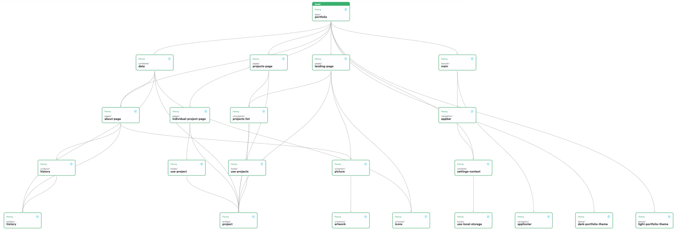
- Examine the repository before componentization
- Examine the repository after componentization
- Examine the Bit organization to see the components exported to their scopes
Initialize a Bit workspace
To start componentizing our project, we'll first initialize a Bit workspace.
The .bitmap file generated at the root of the project lists the components maintained by your workspace. At this point, the workspace is empty of Bit components, and the .bitmap file is empty as well.
To list the components maintained in your workspace, run the following command:
Preview and inspect components in the UI
Your workspace has a UI that you can use to preview components, end explore their configuration and dependency tree.
Run the following to start the UI:
Head over to localhost:3000 to see the UI.
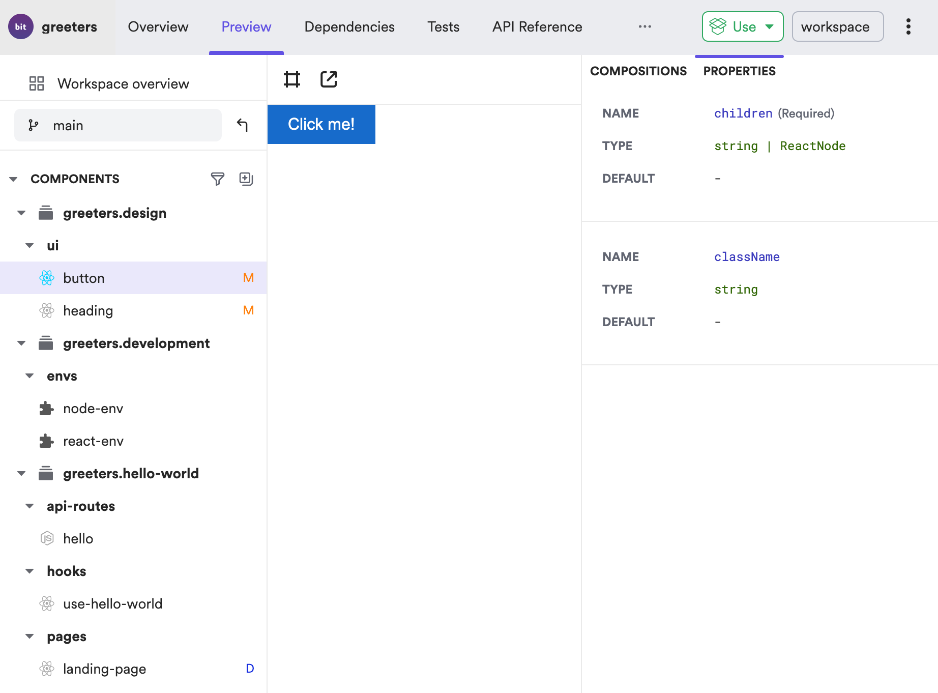
To preview components in isolation, create a
compositionfile for them inside each component directory. To learn more, see React Component Composition.
Track directories as Bit components
What should be a Bit component?
The same reasons that led you to choosing a component-based architecture should be used as guidelines for determining the boundaries of each component. If it is reusability that you're after, then a component should be any group of files that will be reused in more than one place.
However, if you seek maintainability and team autonomy, then a component should be any group of files that serve a single purpose, and can be maintained by a single team. A fully component-based project is composed entirely of components, from the most basic ones all the way to the apps (including the app themselves).
To learn more see Mastering Component-Driven Development.
Start bottom up
A Bit component has to be agnostic to its place in the project, to make it independent and reusable in other projects. A component's internal files must be in the same directory, and cannot have relative paths to files outside of that directory. Modules outside of the component directory, whether they are packages or other Bit components, can only be consumed using their absolute path, the package name.
For that reason, it is advised to start componentizing your project from the bottom up, starting with components that have dependents but not dependencies, and then moving up the dependency tree.
In our example project, the heading component is a good candidate for componentization, since it is a dependency of the landing-page component, but has no dependencies of its own.
Run the following command to track the heading component:
The heading component is now tracked by Bit, and is listed in the .bitmap file. This process should continue with other dependencies of the landing-page component, until its dependency tree is fully componentized.
Once that's done, the landing-page should be componentized as well.
The
headingcomponent has anindex.tsfile that exposes the component's API. By default, Bit will use this file as the component's entry point, or the 'main file'.
The
namespaceoption is used here to categorize the component using a meaningful name that will help organize components in the workspace and scope, and will help in making sense of them.
Check your workspace status to see if there are any issues that need to be resolved, by running the following command:
Change relative paths to absolute paths
Once you're done componentizing the landing-page dependencies, you can componentize the landing-page itself.
Before doing so, you'll need to change the landing-page component's relative paths to its dependencies in the workspace, to the components' absolute paths.
The landing-page component has the following relative paths to its dependencies:
/* change these relative paths to the components' absolute paths */
import { Button } from '../../ui/button';
import { Heading } from '../../ui/heading';
import { useHelloWorld } from '../../hooks/use-hello-world';
/* no need to change this path as it points to a file inside the component directory */
import './landing-page.scss'Run the following to replace the relative paths in your workspace with the components' absolute paths:
The landing-page.tsx file should now have the following absolute paths, instead of the former relative paths:
import { Button } from '@greeters/design.ui.button';
import { Heading } from '@greeters/design.ui.heading';
import { useHelloWorld } from '@greeters/hello-world.hooks.use-hello-world';
import './landing-page.scss'Run the following to track the landing-page directory as a Bit component:
Head over to your workspace UI to inspect its dependencies:
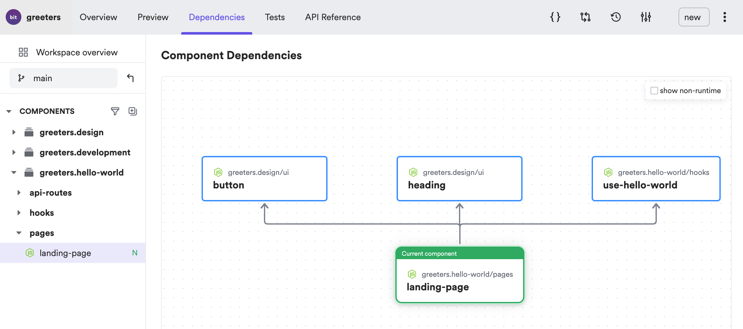
Alternatively, use the following command to list the component's dependencies:
The output should be similar to the following:
Apps as components
As mentioned earlier, a fully component-based project is composed entirely of components. This includes the apps themselves. Our example project has two apps, a frontend React app and the backend API.
Stay tuned for the next blog post in this series, to learn how we componentized the apps in our project. In the meanwhile, have a look at the components that will assist us to componentize the apps:
- The react-app-type component (to bundle the React frontend app)
- The netlify-deployer component (to deploy the app component to Netlify)
- The aws-lightsail-deployer component (to deploy the backend app to AWS LightSail)
Configure envs for components
A Bit component is an independent entity. It should be able to function and maintained independently of its "project of origin". It should not be dependent on the project's build tools and configurations, but rather on its own build tools and configurations. This is done by configuring an envs ('component development environments') for each component.
An env is a single component. It can be shared between teammates working on the same project to ensure all components use the same tools and adhere to the same standards, even when they are developed and delivered independently.
Our project requires two envs, an env for Node components, and an env for React components.
Run the following to create a React env:
Install the dependencies required by the React env (you can also use you current package manager instead of Bit):
Run the following to set the React hooks and React components with the React env:
The output should list all components that were set with the React env:
greeters.hello-world/hooks/use-hello-world
greeters.design/ui/button
greeters.design/ui/heading
greeters.hello-world/pages/landing-page
Run development services
Your components are now configured to run their development services, and can be developed independently of the project.
For example, the landing-page component can be tested by running:
The test file for the landing-page component is located its component directory. The tester and the file extensions to be tested, are both configured by the React env.
The output should be similar to the following:
testing 1 components with environment greeters.development/envs/react-env
PASS web/src/pages/landing-page/landing-page.test.tsx
Test Suites: 1 passed, 1 total
Test: 1 passed, 1 total
Time: 1.5s
Manage dependencies
Dependencies in Bit components are auto-detected and resolved to the dependency version installed. The type and version can be overridden by other factors like your the components' env or manual dependency configuration.
For example, the header component uses the classnames package. Since this package was installed using npm, it is only listed in the package.json file (in the web dir), and not in the workspace.jsonc file.
Run the following to list the header component's dependencies:
The dependency version of classnames is identical to the one configures in the package.json file.
To enjoy the full capabilities provided by Bit, it is recommended to use Bit for dependency installation.
Bit takes into consideration the dependency config in the workspace.jsonc file as well as the project's already-existing package.json.
If you choose to use your current npm client (npm, yarn, etc.) to install dependencies, please add the following as post-install scripts to your package.json:
{
  "scripts": {
    "postinstall": "bit import && bit compile && bit link"
  }
}bit import imports the latest component versions from their remotes scopes (in case they were updated from a different workspace), bit compile compiles all components in the workspace, bit link creates symlinks from the node_module directory to components in your workspace.
Collaboration
Learn how to snap, export and import components, and collaborate with your team in the Collaboration section of the docs.
Learn how to integrate Bit into your git workflow in the Collaborate on a workspace with git page.
Learn how to install components in non-Bit projects in the Installing components page.