How to Create a Composable React App with Bit
In this guide, you'll learn how to build and deploy a full-blown composable React application with Bit.
Building a composable app means that every part of your app is an independent component. From UI elements to entire pages and experiences, every component is essentially a modular "mini-project" you can separately develop, integrate, release, and compose into more apps. Even the app itself is a deployable component. Since it's just a component, we can compose it in this blog post. Here it is:
Bit makes it easy to build this way. You can build infinitely scalable and extendible products, greatly improve your dev experience, and save tons of time. For the organization, it becomes very simple to build new experiences and add them to many products, making development not just faster, but also more efficient and consistent.
You'll learn how to build and deploy your first React app with Bit, add components, and take advantage of the web stack for nested routing.
We'll also learn how to collaborate with other developers while building a toolbox of ready-made components
Here is a deployed example of the app we're going to build. You can hover over components, watch their name and version appear, and click to explore or install them from bit.cloud. You can explore the app component on Bit Cloud here. Take a second to look around, and let's start building!
Please make sure that the Bit binary is installed on your machine:
npx @teambit/bvm install
Setting up our Workspace
Our first step is to create a new Bit Workspace. We can create a new Workspace using the React-App Workspace template. It contains all the necessary config files, including some basic components:
Congrats! You have created a new Bit Workspace. Here's what it should look like:
You can see the components you've created in the .bitmap file. As mentioned, in Bit each component is versioned, built, and tested separately from the other. By resolving your implementation file's import statements, your package.json is automatically generated with all the dependencies.
The components that were generated from the template belong to you now. Make sure you change the import statements in the apps/my-app/app.tsx file.
This is how it looks with my scope entered:
- import { BaseTheme } from "@teambit/react.templates.themes.theme";
- import { Home } from "@teambit/react.templates.pages.home";

+ import { BaseTheme } from '@nitsan770/react-app.themes.theme';
+ import { Home } from '@nitsan770/react-app.pages.home';Without further ado, let's run the app:
An app is also just a component in Bit. Normally, we wouldn't have any components dependent on the app, but to demonstrate that it is only a component, I installed it as a dependency in this blog post component and rendered it here:
If you hover over each component in the app, you can see that it has its own version. You can click on it to see the component on bit.cloud.
Let's run the Workspace dev server to view each component separately:
Creating additional components
Now that our app is running, let's add a new component:
With the command above, you will create a new component named blocks/header from the react template.
Component templates can be easily created to meet your needs.
The Workspace UI now shows it, but we need to add it to app.tsx for it to appear in the app.
import React from 'react';
import { BaseTheme } from '@nitsan770/react-app.themes.theme';
import { Home } from '@nitsan770/react-app.pages.home';
import { Header } from '@nitsan770/react-app.blocks.header'; // <-- import the component. Notice the absolute path.
import { ComponentHighlighter } from '@teambit/react.ui.component-highlighter';
import { Routes, Route } from 'react-router-dom';

export function ReactTemplateApp() {
  return (
    <Theme>
      <ComponentHighlighter>
        <Header>hello world!</Header> {/* <-- render the component */}
        <Routes>
          <Route path="/" element={<Home />} />

          <Route
            path="/about"
            element={
              {
                /* about page component */
              }
            }
          />
        </Routes>
        {/* footer component */}
      </ComponentHighlighter>
    </Theme>
  );
}Hello World header. Innovation at its peak.
To make it look like an actual header, let's install the header from our design scope and compose it with the header we just created:
The Bit Blog, bit.dev, and some other apps (such as this) also depend on this component. Although these apps don't share the same repository (some don't have one), they will receive updates whenever the header is updated from the design scope. CBSE at its finest.
Here's the implementation of the header:
import React from 'react';
import {
  Header as BaseHeader,
  HeaderProps as BaseHeaderProps,
} from '@teambit/design.blocks.header';
import { Logo } from '@teambit/design.ui.brand.logo';

export type HeaderProps = {} & BaseHeaderProps;

const plugins = [<div>hello world!</div>];

export function Header({ className, ...rest }: HeaderProps) {
  return (
    <BaseHeader
      {...rest}
      plugins={plugins}
      logo={
        <a href="https://bit.cloud">
          <Logo />
        </a>
      }
    />
  );
}We have designed this component to be extendible, as you can see. Adding plugins to it will allow us to customize it for each app. Read more about extendible UI here.
Routing and nested routes
With our header in place, let's create a page component containing nested routes.
By having nested routes in independent components, you can render this page component in any route. The app (or any other component consuming this page) does not need to know about the nested routes. It is completely up to the developer to decide how to develop the component's routes. Since this page is an independent component, it can be used in any app.
You might have noticed that this app uses react-router. The reason we chose this one here is that they accommodate nesting routes very well. You can, however, use any router library you like. As a matter of fact, our universal link component works with any router library.
Create the page:
And add it to our app:
import React from 'react';
import { BaseTheme } from '@nitsan770/react-app.themes.theme';
import { Header } from '@nitsan770/react-app.blocks.header';
import { Home } from '@nitsan770/react-app.pages.home';
import { About } from '@nitsan770/react-app.pages.about'; // <-- import the component. Notice the absolute path.
import { ComponentHighlighter } from '@teambit/react.ui.component-highlighter';
import { Routes, Route } from 'react-router-dom';

export function ReactTemplateApp() {
  return (
    <BaseTheme>
      <ComponentHighlighter>
        <Header />
        <Routes>
          <Route path="/" element={<Home />} />
          <Route path="/about/*" element={<About />} /> {/* <-- render the component. Notice the wildcard */}
        </Routes>
        {/* footer component */}
      </ComponentHighlighter>
    </BaseTheme>
  );
}Here are the styles for the page component:
.page {
  display: grid;
  place-items: center;
  padding: 1rem;
}

.nav {
  display: flex;
  gap: 1rem;
  margin-top: 1rem;
}You might have noticed we use CSS modules. CSS modules allow you to style components in an encapsulated manner. When building independent components, we want each developer to be autonomous and not clash with the style of another developer. The React env already supports CSS modules, so you don't need to do anything to enable it.
Here's the implementation of the about page:
import React from 'react';
import { Paragraph } from '@teambit/design.typography.paragraph';
import { Heading, Elements } from '@teambit/design.ui.content.heading';
import { Link } from '@teambit/base-react.navigation.link';
import { Routes, Route } from 'react-router-dom';
import styles from './about.module.scss';

export type AboutProps = {} & React.HtmlHTMLAttributes<HTMLDivElement>;

export function About(props: AboutProps) {
  return (
    <div className={styles.page} {...props}>
      <nav className={styles.nav}>
        <Link href="what">What</Link>
        <Link href="why">Why</Link>
      </nav>
      <Routes>
        <Route
          index
          element={
            <>
              <Heading element={Elements.H1}>
                Find out what Bit is and why you should use it
              </Heading>
              <Paragraph>
                Navigate between the nested routes to find out what Bit is and
                why you should use it. If you hover over this area you can see
                that this component is totally independent and can be rendered
                on any page and in any route.
              </Paragraph>
            </>
          }
        />
        <Route
          path="what"
          element={
            <>
              <Heading element={Elements.H1}>What is Bit?</Heading>
              <Paragraph>
                Bit is an open-source toolchain for composing component-driven
                software. Use it to build any type of software in independent,
                modular, reusable components.
              </Paragraph>
            </>
          }
        />
        <Route
          path="why"
          element={
            <>
              <Heading element={Elements.H1}>Why use Bit?</Heading>
              <Paragraph>
                Discover what Bit is and why you should use it by navigating
                between the nested routes. As you hover over this area, you'll
                see it's completely independent and can be rendered on any page.
              </Paragraph>
            </>
          }
        />
      </Routes>
    </div>
  );
}You can see that it has nested routes.
Bit components are configured with Environment components. Envs provide the dev services and workflows needed for component development, such as testing, compiling, linting, formatting, previewing and more (such as CSS modules).
Let's set the env of our newly created component to our community react env:
Versioning and exporting components
As mentioned earlier, Bit components are independent and can be reused in any app/product. We have already seen the page component is used as a dependency in this blog post component.
Builds are also incremental, so we build only the modified components.
To build components, run bit build. Only the modified components will be built and tested in this command.
The build pipeline will also execute (with the tests) when we tag (version) components. Let's tag them with their first version:
Following the build, the tag pipeline deploys the app component wherever you specify. We'll have a closer look into that in the next section.
The tests for the pages/about component failed, and that is a good sign:
The following errors were found while running the build pipeline
Failed task 1: "teambit.defender/tester:TestComponents" of env "teambit.community/envs/community-react@2.1.5"
component: nitsan770.react-app/pages/about@0.0.1
Error: ● should render with the correct textThis ensures that we don't have any bugs in our components and that every tagged version is tested.
Let's fix the tests:
import React from 'react';
import { render } from '@testing-library/react';
import { BasicAbout, AboutWhyBit } from './about.composition';

describe('about page - what route', () => {
  it('should render the about page heading', () => {
    const { getByText } = render(<BasicAbout />);
    expect(getByText('What is Bit?')).toBeInTheDocument();
  });

  it('should render the paragraph', () => {
    const { getByText } = render(<BasicAbout />);
    expect(
      getByText(
        'Bit is an open-source toolchain for composing component-driven software. Use it to build any type of software in independent, modular, reusable components.'
      )
    ).toBeInTheDocument();
  });
});

describe('about page - why route', () => {
  it('should render the about page heading', () => {
    const { getByText } = render(<AboutWhyBit />);
    expect(getByText('Why use Bit?')).toBeInTheDocument();
  });

  it('should render the paragraph', () => {
    const { getByText } = render(<AboutWhyBit />);
    expect(
      getByText(
        'Using Bit, you can build modular, reusable software to boost your productivity. Code duplication and boilerplate writing are no more. Every process is standardized and can be extended with new features.'
      )
    ).toBeInTheDocument();
  });
});Tagging again will reveal this happy message:
5 component(s) tagged
(use "bit export [collection]" to push these components to a remote")
(use "bit reset" to unstage versions)

new components
(first version for components)
     > apps/my-app@0.0.1
     > blocks/header@0.0.1
     > pages/about@0.0.1
     > pages/home@0.0.1
> themes/theme@0.0.1As all components are versioned and have a consumable package, it's time to export them to a remote server so that others can use them.
You can host your components on your own server, but the easiest and most convenient way is to use Bit Cloud.
Run the following command to export your components to Bit Cloud:
Deploying our app component
An app component differs from a regular component in that it can be deployed. In the tag pipeline, we can integrate with the deploy task.
To where will it be deployed? Well, that's up to you. In this example, however, we'll deploy it using Netlify's deployer component.
First, install the Netlify deployer component:
Then, add it to the tag pipeline. In the my-app.react-app.ts file, add this content:
import type { ReactAppOptions } from '@teambit/react';
import {
  Netlify,
  NetlifyOptions,
} from '@teambit/cloud-providers.deployers.netlify';

const netlifyConfig: NetlifyOptions = {
  accessToken: process.env.NETLIFY_AUTH_TOKEN as string,
  siteName: 'my-app-is-now-deployed',
  team: 'teambit',
};

const netlify = new Netlify(netlifyConfig);

export const MyApp: ReactAppOptions = {
  name: 'my-app',
  entry: [require.resolve('./my-app.app-root')],
  deploy: netlify.deploy.bind(netlify),
};

export default MyApp;Don't forget to genereate the Netlify auth token and export it as an environment variable. Also make sure you replace 'teambit' with your team name.
That's it! Now every time you tag your app component, it will be deployed to Netlify.
The incremental nature of Bit builds means that only what has changed will be rebuilt, meaning deployment times are much quicker (and you don't have to fight on the main branch).
Here's a sneak peek at a new product released on bit.cloud later this year called Ripple CI - the first component-driven continuous integration tool.
With Ripple, you only build components, not projects. When you update a component, Ripple will run for that component and every dependent component impacted by the change, across your entire system and apps.
As a result, your builds run much faster. They propagate to every impacted product and simulate the change. In addition, they will save tons of time by isolating failures and errors, so you don't have to run everything again. It's still in beta for now :)
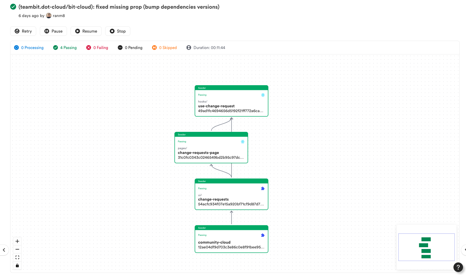
In the picture above from Ripple-CI, you can see changes were made to the use-change-request hook. Consequently, only dependent components are rebuilt and versioned until the app component is deployed (if all tests and builds pass).
Collaborating on components
A very powerful aspect of building composable components is that you can use them in more than one application. For example, each component is also a package you can install in new projects.
This is how you install components from bit.cloud:
Let's initialize a new Workspace to see how it works. Run the following command in another directory:
We already have our about and header page components. Let's install them to our new project:
The app component will look just like our previous app:
import React from 'react';
import { BaseTheme } from '@nitsan770/another-react-app.themes.theme';
import { ComponentHighlighter } from '@teambit/react.ui.component-highlighter';
import { Header } from '@nitsan770/react-app.blocks.header';
import { About } from '@nitsan770/react-app.pages.about';
import { Home } from '@nitsan770/another-react-app.pages.home';
import { Routes, Route } from 'react-router-dom';

export function ReactTemplateApp() {
  return (
    <BaseTheme>
      <ComponentHighlighter>
        <Header />
        <Routes>
          <Route path="/" element={<Home />} />

          <Route path="/about" element={<About />} />
        </Routes>
        {/* footer component */}
      </ComponentHighlighter>
    </BaseTheme>
  );
}Now let's say we want to propose changes to the header component. But we don't have it in our workspace. Let's import the header component into our workspace:
Importing a component differs from installing it. A component's package is available in your node_modules folder when you install it, but you cannot modify it. Whenever you import a component, you also have access to its source code, and you can modify it.
This is the change we are going to implement:
import React from 'react';
import {
  Header as BaseHeader,
  HeaderProps as BaseHeaderProps,
} from '@teambit/design.blocks.header';
import { Logo } from '@teambit/design.ui.brand.logo';

export type HeaderProps = {} & BaseHeaderProps;

const plugins = [<div>hello world!</div>, <div>another plugin added</div>]; // added a plugin

export function Header({ className, ...rest }: HeaderProps) {
  return (
    <BaseHeader
      {...rest}
      plugins={plugins}
      logo={
        <a href="https://bit.cloud">
          <Logo />
        </a>
      }
    />
  );
}Since we are not responsible for updating this component, we do not want to tag it with a new version.
Instead, we will create a lane and snap it. After we export it to the cloud the owner of the component will be able to see the changes and decide if they want to accept (merge) them or not.
You automatically checkout to a lane when you create one:
And snap it:
By doing this, you will create a hashed version of the component that cannot be consumed by other developers. As a bonus, our app component was also snapped, even though only the header was changed:
changed components
(components that got a version bump)
     > nitsan770.react-app/blocks/header@f928019a2295dbcc553ec2e14196f38e556a5b8d
       auto-snapped dependents (1 total):
apps/my-app@358a3c8d23de6a1a12f55f2f7c3cb8b1ed044a62We can now export the lane to the cloud:
The lane is exported to our scope:
exported the following 4 component(s) from lane header:
nitsan770.another-react-app/apps/my-app
nitsan770.another-react-app/pages/home
nitsan770.another-react-app/themes/theme
nitsan770.react-app/blocks/headerYou can easily review the lane with the component compare feature:
Next Steps
In this tutorial, you've created and deployed your first composable application. Congrats!
You've learned how to spawn a workspace, create the application, add components, utilize modern-web features, deploy your app, and use components in more applications.
By building your apps in a modular and composable way you vastly improve your developer experience. This makes it easy for your team to build high-quality apps together fast, efficiently, and consistently at scale.
You can continue to grow this app and add new components, start a new app, or just start building and introducing composable components into your existing projects.
Just head to the Documentation to learn more or join the community Slack channel to ask anything.