Theming React Apps with Styled Components and Bit
As UI developers, we often want to separate the presentation from the interaction so that we can apply the same CSS across many interactions. It's not only more cost-effective but also ensures consistency.
With CSS-in-JS we can easily separate the presentation (CSS) from the interaction (Business logic). The CSS of Styled Components is encapsulated with a hashed class name (similar to what CSS modules do). This way we ensure that the CSS is only applied to the component that it is intended for.
In combination with Bit, this tool allows you to create highly adaptable and maintainable components that you can use across your entire organization to ensure consistency.
In this guide, we will use Styled System which is a utility-first styling library that works in conjunction with CSS-in-JS libraries such as Styled Components.
We are going to build:
- A theme component - will be used to style our components. The theme component will be decoupled from the app, which allows it to be reused across the organization (not only in one app).
- Some basic presentational components (CSS in JS). Due to their high extendability, these components are very flexible and adaptable.
- A custom env component that will wrap all the component's compositions with the theme-provider.
- An app component - will be used to showcase our components (along with the theme component).
Runtime CSS-in-JS performance
While styled components are very convenient to work with, it may not scale well. A big application's performance can be affected by the fact that styled-components are transpiled into CSS at runtime.
But...
If you insist...
If you have a large application, and you insist on using CSS-in-JS, you can extend Bit to support libraries such as Linaria, which transpiles the JS into CSS at build time.
This post was inspired by the wonderful post about Micro Components by Lawrence Eagles.
Setting up the Workspace
The first step is to create a Bit Workspace. A Workspace is a development and staging area for components. Here, we create new components, retrieve and modify existing ones, and compose them together.
Bit’s workspace is where you develop and compose independent components. Components are not coupled to a workspace; you can dynamically create, fetch, and export components from a workspace and only work on them without setup.
Each component is a standalone “mini-project” and package, with its own codebase and version. The workspace makes it easy to develop, compose, and manage many components with a great dev experience.
You can develop all types of components in the workspace, which is tech-agnostic. A workspace can be used as a temporary, disposable context for components, or as a long-term workshop.
Without further ado, let's create a Workspace. In the designated directory, run the following command:
In the root of your workspace, two files and one directory will be created:
workspace.jsonc: This file contains the configuration of the Workspace..bitmap: Here Bit keeps track of which components are in your workspace. You shouldn't edit this file directly..bit: This is where the component's objects are stored.
Here is how the Workspace looks like:
Please ensure you replace "defaultScope": "[your-bit-cloud-username].[scope-name]" with your Bit Cloud user name and the scope name.
Creating the theme component
The theme component will be the first component we create. This component is passed down through the ThemeProvider component from the styled-components library.
To create the component, we'll use the node template since it's basically an object.
In the base-theme.ts file, we will create the following object:
export const baseTheme = {
  space: [4, 8, 12, 16, 32, 64, 128],
  fontSizes: [16, 18, 24, 28],
  fontWeights: [100, 200, 300, 400, 500, 600, 700, 800, 900],
  lineHeights: [1.5, 1.8, 2, 2.5],
  borders: ['2px solid', '4px solid', '6px solid', '8px solid', '10px solid'],
  radii: [0, 2, 4, 6, 8, 10, 12, 16],
  colors: {
    info: '#1ecbe1',
    primary: '#1676e9',
    danger: '#e72918',
    success: '#6bc33c',
    warning: '#fff900',
    blacks: [
      'rgba(0,0,0)',
      'rgba(0,0,0,.1)',
      'rgba(0,0,0,.2)',
      'rgba(0,0,0,.25)',
      'rgba(0,0,0,.3)',
      'rgba(0,0,0,.4)',
      'rgba(0,0,0,.5)',
      'rgba(0,0,0,.6)',
      'rgba(0,0,0,.7)',
      'rgba(0,0,0,.8)',
      'rgba(0,0,0,.9)',
    ],
    whites: [
      'rgba(255,255,255,.1)',
      'rgba(255,255,255,.2)',
      'rgba(255,255,255,.3)',
      'rgba(255,255,255,.4)',
      'rgba(255,255,255,.5)',
      'rgba(255,255,255,.6)',
      'rgba(255,255,255,.7)',
      'rgba(255,255,255,.8)',
      'rgba(255,255,255,.9)',
    ],
  },
};
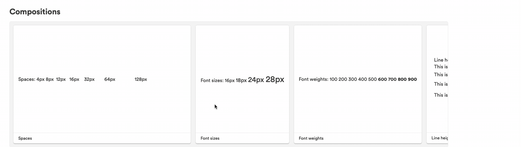
export type Theme = typeof baseTheme;The composition file allows us to visualize the values:
import React from 'react';
import { baseTheme } from './base-theme';

export function Spaces() {
  return (
    <div>
      Spaces:{'  '}
      {baseTheme.space.map((space, index) => (
        <span style={{ marginRight: space }} key={index}>
          {space}px
        </span>
      ))}
    </div>
  );
}

export function FontSizes() {
  return (
    <div>
      Font sizes:{'  '}
      {baseTheme.fontSizes.map((fontSize, index) => (
        <span style={{ fontSize }} key={index}>
          {fontSize}px{' '}
        </span>
      ))}
    </div>
  );
}

export function fontWeights() {
  return (
    <div>
      Font weights:{'  '}
      {baseTheme.fontWeights.map((fontWeight, index) => (
        <span style={{ fontWeight }} key={index}>
          {fontWeight}{' '}
        </span>
      ))}
    </div>
  );
}

export function LineHeights() {
  return (
    <div>
      Line heights:{'  '}
      {baseTheme.lineHeights.map((lineHeight, index) => (
        <div style={{ lineHeight }} key={index}>
          This is {lineHeight} line height
        </div>
      ))}
    </div>
  );
}

export function Borders() {
  return (
    <div>
      Borders:{'  '}
      {baseTheme.borders.map((border, index) => (
        <div
          style={{ border, padding: '10px', marginBottom: '8px' }}
          key={index}
        >
          {border}
        </div>
      ))}
    </div>
  );
}

export function Colors() {
  return (
    <div>
      {Object.keys(baseTheme.colors).map((color, index) => {
        if (Array.isArray(baseTheme.colors[color])) {
          return (
            <div
              key={index}
              style={{
                backgroundColor: color === 'whites' ? 'black' : 'white',
              }}
            >
              {color}:
              {baseTheme.colors[color].map((shade: string, index: number) => (
                <span key={index} style={{ backgroundColor: shade }}>
                  {' '}
                  {shade}
                </span>
              ))}
            </div>
          );
        }
        return (
          <div style={{ backgroundColor: baseTheme.colors[color] }}>
            {color}
          </div>
        );
      })}
    </div>
  );
}Here's how it looks:
These values can be used in different apps, even without styled-components. Therefore, team autonomy is granted while visual consistency is maintained.
All we need to do is install the theme in any project, and we're ready to roll. We are always up to date with the latest design tokens since the components are versioned, or we can fall back to an older version if something breaks. Learn how our apps are maintained with design tokens here.
Creating the presentational components
Let's create some (styled) components.
Firstly, let's install our dependencies:
Bit installs packages using pnpm behind the scenes. Any package manager will work with Bit, but pnpm is super fast, so we recommend sticking with it.
Run the following command:
Bit will create a component named shadow from the React template (which contains the boilerplate files).
Your workspace should now look like this:
The implementation of the component can be found in shadow.tsx:
import styled from 'styled-components';
import { shadow, ShadowProps } from 'styled-system';

export const Shadow = styled.div<ShadowProps>`
  ${shadow}
`;
export default Shadow;The shadow function imported from the styled-system will make our life easier by exposing the boxShadow property.
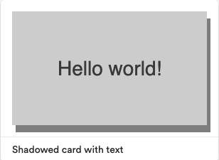
As an example, we could use the Shadow component as follows:
<Shadow boxShadow="0px 0px 10px rgba(0, 0, 0, 0.5)">
  <div>Hello World</div>
</Shadow>The next component is:
Here is how it is implemented:
import styled from 'styled-components';
import { typography, TypographyProps } from 'styled-system';
const Header = styled.div<TypographyProps>`
  ${typography}
`;
export default Header;And here's how we can use it:
<Header fontSize={[4, 5]}>Hello World</Header>You might be wondering what this array we pass to fontSize means. It's a useful way to create responsive font sizes (try shrinking your screen to see it in action).
Now that we've created the first two components, let's build some compositions and tests.
Testing and visualizing the components
Let's start by creating our compositions. Compositions allow components to be visualized. Developers can learn about the component's purpose and how to use its API through this.
However, that's not all.
Compositions combine components to simulate their behavior, as their name implies. As a result, we can not only test the component's behavior in isolation (unit tests) but also in conjunction with other components (integration tests).
Here are the compositions for the shadow component:
import React from 'react';
import { Header } from '@nitsan770/styled-components.header';
import { Shadow } from './shadow';

export const BasicShadow = () => {
  return (
    <Shadow boxShadow="0px 0px 10px rgba(0, 0, 0, 0.1)">
      <div>Hello World!</div>
    </Shadow>
  );
};

export const ShadowedHeader = () => {
  return (
    <Shadow boxShadow="0px 0px 10px rgba(0, 0, 0, 0.1)">
      <Header>Hello World!</Header>
    </Shadow>
  );
};As you might have noticed, we are importing the Shadow component from its package. When Bit detects this package is used in a dev file (the composition file), it adds it as a dev dependency. You don't have to worry about that :)
And here are the compositions for the header component:
import React from 'react';
import { Header } from './header';

export const HeaderWithFontSize = () => {
  return <Header fontSize={[3, 4]}>hello world!</Header>;
};

export const HeaderWithFontWeight = () => {
  return <Header fontWeight="bold">hello world!</Header>;
};

export const HeaderWithFontStyle = () => {
  return <Header fontStyle="italic">hello world!</Header>;
};We can now test the compositions.
First the header tests:
import React from 'react';
import { render } from '@testing-library/react';
import * as HeaderCompositions from './header.composition';

describe('Header', () => {
  it('should render with the correct font size', () => {
    const { getByText } = render(<HeaderCompositions.HeaderWithFontSize />);
    const rendered = getByText('hello world!');
    expect(rendered).toHaveStyle('font-size: 20px');
  });
  it('should render with the correct font weight', () => {
    const { getByText } = render(<HeaderCompositions.HeaderWithFontWeight />);
    const rendered = getByText('hello world!');
    expect(rendered).toHaveStyle('font-weight: bold');
  });
  it('should render with the correct font style', () => {
    const { getByText } = render(<HeaderCompositions.HeaderWithFontStyle />);
    const rendered = getByText('hello world!');
    expect(rendered).toHaveStyle('font-style: italic');
  });
});Let's keep the shadow tests simple:
import React from 'react';
import { render, screen } from '@testing-library/react';
import * as ShadowCompositions from './shadow.composition';

describe('Shadow', () => {
  it('should render with the correct text', () => {
    render(<ShadowCompositions.BasicShadow />);
    const rendered = screen.getByText('Hello World!');
    expect(rendered).toBeInTheDocument();
  });
  it('should render with the correct text', () => {
    render(<ShadowCompositions.ShadowedHeader />);
    const rendered = screen.getByText('Hello World!');
    expect(rendered).toBeInTheDocument();
  });
});If you want to check if your tests pass, you can run bit test, but we plan to skip that since Bit will automatically test our components when we tag them with their first version in the next section.
Versioning and exporting the components
In Bit, each component is versioned independently. In other words, only modified components are versioned when we run bit tag.
Shadow, Header and the base-theme are new components as you can see that if you run bit status:
new components
(use "bit tag [version]" to lock a version with all your changes)

     > header ... ok
     > shadow ... ok
> themes/base-theme ... okLet's tag them with their first versions.
Once you tag a component, Bit will test, build, and create a consumable NPM package. As a final result, here is what you want:
new components
(components that got a version bump)
     > nitsan770.styled-components/header@0.0.1
     > nitsan770.styled-components/shadow@0.0.1
> nitsan770.styled-components/themes/base-theme@0.0.1Capsules are special environments where testing and building of the component will take place. The capsule is decoupled from your workspace (bit creates a folder for it) and each component is tested/built separately. Hence, components are never coupled with the workspace.
Excellent! It's time to publish our components so that other developers in the organization can utilize them.
To export components, use this command:
Before exporting your components, make sure you log in using `bit login` cli command, and create the remote scope on bit.cloud.
After you export your components, they will be fully discoverable and available for other developers to use:
You'll be disappointed to discover that none of our styles are applied to any of the compositions when you visit them on the web. This is happening because we did not wrap them in the theme provider.
We can certainly wrap every composition with the theme provider, but that would take a lot of effort and is a standard method.
We can instead create a custom environment component. In the next section, we'll explore that.
Creating the custom env
Envs are reusable component development environments. By setting a specific env to a component you define the component’s "type", for example React, Angular or Node. Each requires a different setup, tools, and configs.
Envs provide the dev services and workflows needed for component development, such as testing, compiling, linting, formatting, previewing and more. You can easily customize envs, and reuse them across components, as envs are also components.
A single workspace can have different envs for different types of components, so you can run the same flow for all components of the same type in a single command.
We will create a custom react-env template and add the theme provider to each component preview in this example.
Run the following command to create the environment component:
Create a file called styled-component.theme.tsx in the folder of that component and fill it with the following:
import React from 'react';
import { ThemeProvider } from 'styled-components';
import { baseTheme } from '@nitsan770/styled-components.themes.base-theme';

export const StyledComponentsThemeProvider: React.FC = ({ children }) => (
  <ThemeProvider theme={baseTheme}>{children}</ThemeProvider>
);The react-styled-components.preview.tsx file should be modified as follows:
import { PreviewRuntime } from '@teambit/preview';
import { ReactAspect, ReactPreview } from '@teambit/react';
import { StyledComponentsThemeProvider } from './styled-components.theme'; // <--- import the provider

import { ReactStyledComponentsAspect } from './react-styled-components.aspect';

export class ReactStyledComponentsPreviewMain {
  static runtime = PreviewRuntime;

  static dependencies = [ReactAspect];

  static async provider([react]: [ReactPreview]) {
    const reactStyledComponentsPreviewMain =
      new ReactStyledComponentsPreviewMain();
    react.registerProvider([StyledComponentsThemeProvider]); // <--- register the provider

    return reactStyledComponentsPreviewMain;
  }
}

ReactStyledComponentsAspect.addRuntime(ReactStyledComponentsPreviewMain);All we need to do now is set the components with the newly generated environment:
Circular dependency
Make sure that the theme component is not accidentally set up with the new environment, or you will get a circular dependency (the environment depends on the theme, and the theme depends on the environment).
Don't forget to replace my user and scope names with yours.
You can see how the components are rendered with the theme in the workspace UI after running bit install and bit compile:
Consuming the components in an app
Let's create another workspace with an app that consumes our components. In a different folder, run the following command:
And install the components and other dependencies in our new Workspace:
Now we can use the theme in the app.tsx file:
import React from 'react';
import { baseTheme } from '@nitsan770/styled-components.themes.base-theme';
import { Home } from '@nitsan770/styled-components-app.pages.home';
import { ComponentHighlighter } from '@teambit/react.ui.component-highlighter';
import { Routes, Route } from 'react-router-dom';
import { ThemeProvider } from 'styled-components';

export function ReactTemplateApp() {
  return (
    <ThemeProvider theme={baseTheme}>
      <ComponentHighlighter>
        {/* header component */}
        <Routes>
          <Route path="/" element={<Home />} />

          <Route
            path="/about/*"
            element={
              {
                /* about page component */
              }
            }
          />
        </Routes>
        {/* footer component */}
      </ComponentHighlighter>
    </ThemeProvider>
  );
}And use the components in the home.tsx file:
import React from 'react';
import { Flex } from '@nitsan770/styled-components.flex';
import { Text } from '@nitsan770/styled-components.text';

export function Home() {
  return (
    <>
      <Flex bg={'info'} p={4} mx={2} my={2}>
        <Text
          textAlign="center"
          color={'blacks.0'}
          fontSize={[0, 1, 2, 3]}
          lineHeight={1}
        >
          This is an info box, with responsive typography that changes based on
          the view port.
        </Text>
      </Flex>

      <Flex bg={'success'} p={4} mx={2} my={2}>
        <Text
          textAlign="center"
          color={'blacks.0'}
          fontSize={[0, 1, 2, 3]}
          lineHeight={1}
        >
          This is a success box, with responsive typography that changes based
          on the view port.
        </Text>
      </Flex>

      <Flex bg={'warning'} p={4} mx={2} my={2}>
        <Text
          textAlign="center"
          color={'blacks.0'}
          fontSize={[0, 1, 2, 3]}
          lineHeight={1}
        >
          This is a warning box, with responsive typography that changes based
          on the view port.
        </Text>
      </Flex>
    </>
  );
}You can run the app in the browser:
And here is the colorful result:
This is only the tip of the iceberg when it comes to building apps with Bit. Check out this mdx componentand this blog post for more information about building apps with Bit.
Proposing changes and extending components
Let's say that the flex component needs to be enhanced with some more props.
Creating another component within our scope and extending the base component is the most straightforward solution.
In the styled-components-app scope, let's create a new component:
And set it with the react-styled-components environment:
Now we can extend the flex component:
import { Flex, FlexProps } from '@nitsan770/styled-components.flex';
import { layout, LayoutProps } from 'styled-system';
import styled from 'styled-components';

export type BoxProps = {} & FlexProps & LayoutProps;

export const Box = styled(Flex)<BoxProps>`
  ${layout}
`;
We added the layout prop from styled-system to the component. The best thing is that Bit will maintain the relationship between the base component and the extended component.
We can always choose if we want to receive updates from the base component or not:
Sometimes we want to modify the base component, instead of extending it.
Assume the designer in our team adds a new color to the theme. It will be necessary to change the source code of the original component.
To begin, we must import the theme component into our workspace:
Although the component had already been installed in our app, its source code could not be modified. We can modify the source code of a component by importing it into our workspace and exporting the updated version back into the scope.
We are implementing the following change:
export const baseTheme = {
  space: [4, 8, 12, 16, 32, 64, 128],
  fontSizes: [16, 18, 24, 28],
  fontWeights: [100, 200, 300, 400, 500, 600, 700, 800, 900],
  lineHeights: [1.5, 1.8, 2, 2.5],
  borders: ['2px solid', '4px solid', '6px solid', '8px solid', '10px solid'],
  radii: [0, 2, 4, 6, 8, 10, 12, 16],
  colors: {
    info: '#1ecbe1',
    primary: '#1676e9',
    danger: '#e72918',
    success: '#6bc33c',
    warning: '#fff900',
    gold: '#FFD700', // <--- I like gold
    blacks: [
      'rgba(0,0,0)',
      'rgba(0,0,0,.1)',
      'rgba(0,0,0,.2)',
      'rgba(0,0,0,.25)',
      'rgba(0,0,0,.3)',
      'rgba(0,0,0,.4)',
      'rgba(0,0,0,.5)',
      'rgba(0,0,0,.6)',
      'rgba(0,0,0,.7)',
      'rgba(0,0,0,.8)',
      'rgba(0,0,0,.9)',
    ],
    whites: [
      'rgba(255,255,255,.1)',
      'rgba(255,255,255,.2)',
      'rgba(255,255,255,.3)',
      'rgba(255,255,255,.4)',
      'rgba(255,255,255,.5)',
      'rgba(255,255,255,.6)',
      'rgba(255,255,255,.7)',
      'rgba(255,255,255,.8)',
      'rgba(255,255,255,.9)',
    ],
  },
};

export type Theme = typeof baseTheme;The theme component, however, lives in another scope and is maintained by the infrastructure team. The infrastructure team has to review the component before tagging it with a new version. Instead of tagging the component, we can open a lane and snap the changes:
Create a new lane by running the following command:
You switch to a lane automatically when you create one. We can now snap our changes:
Success! The lane with the snapped components is ready to be exported to the scope.
changed components
(components that got a snapped)
     > nitsan770.styled-components-app/ui/box@0855493766f070e81cc7e95faa5235679ee9b916
     > nitsan770.styled-components-app/apps/my-app@bbe364c986f6b1f847bf49bcda2687a4cdf1f2d1
     > nitsan770.styled-components-app/pages/home@c1d6535e933f689c4bf8b2b6cadac3cb16a83cd6
> nitsan770.styled-components/themes/base-theme@0c2fee5a430d0d5681df278e7e811b73272e257dLet's export:
The lane is now available on bit.cloud, and we can review the changes using the component compare feature:
As Bit components include not only source code, but also documentation, compositions, tests and configurations, we can compare them all.
But not only that.
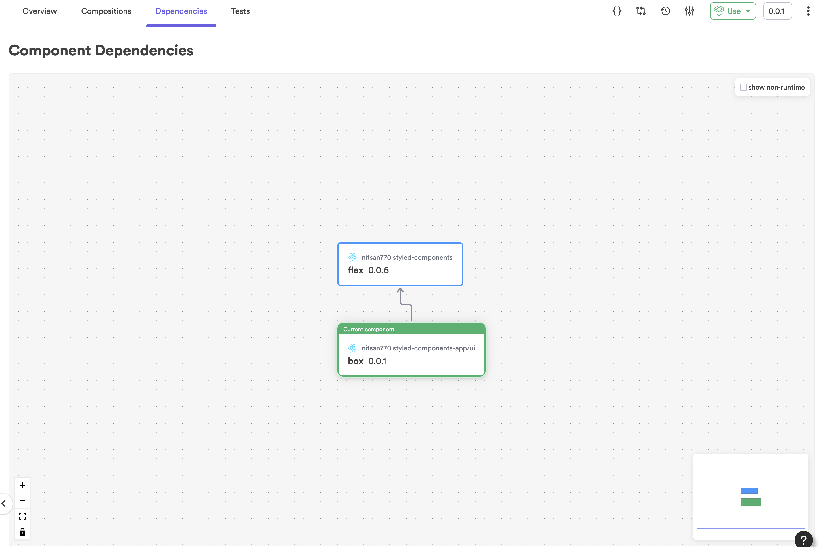
Dependencies exist between components as well. Thus, when we change the theme component, the app that depends on it will also be snapped and we can review that component as well:
Recap
Here we are at the end of a long ride. This wasn't just a guide on how to use styled components with Bit. By exploring Bit's components-driven world, we saw how it makes us better developers - consistent and effective with the ability to change and deploy incrementally.
In summary, here are a few key takeaways:
- Using styled-components, you can write React components that focus on presentation. These components follow the single-responsibility principle (SRP).
- As an independent component, the theme can be decoupled from the app and used in multiple applications.
- Components created with Bit are easy to use because they are well documented and have compositions demonstrating how to use them.
- Because these components are tested before every release, they can also be trusted.
- Since only modified components and their dependents are tagged, versioning components is incremental and saves us time.
- Components can be exported to a remote scope, then imported into any workspace individually (you don't have to clone the whole monolith).
- Many processes are standardized with components environments. This post only explored wrapping components with a theme component, but there are many other ways to ensure standardization (linting, testing, building, etc.).
- To change a component, either extend its API or import it into the workspace to propose the change through a lane.
Thanks for reading. I hope you enjoyed it. The Bit documentation contains a great deal of information, so I encourage you to explore them all. Let us know if you have any questions or comments on our Slack channel.